Sunday, June 26, 2016

Book Collecting

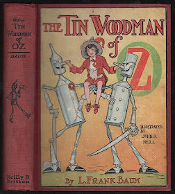
This copy of The Tin Woodman of Oz was the first Reilly & Britton Oz title I purchased for my collection. I started looking for Oz books in the early 1970's, at a time when the "white cover" editions could still be found, bearing the Reilly & Lee imprint. But at the age of 13 or so I decided I wanted to put together a collection of first editions and find the earlier Reilly & Britton versions of the books. I think it took close on 10 years before I finally began to find collectible copies of the titles - and the hunt hasn't ended! Finding this book was exciting as it was the first early copy of a Baum book that I had run across. Eventually this was replaced by a better copy, then a copy with a dust jacket.

Book collecting was quite different when I started, well before the introduction of internet book searches. It involved visiting any used book store you might run across in hopes of finding a treasure, mailing away for catalogs and book lists, getting to know dealers in hopes that you would be informed if something special turned up. Finding a title was an event, and something that might not happen again. All of that is still true today, but now a quick search with a keyboard will turn up dozens of titles without leaving your chair. Not that the challenge isn't still there - it's just a different kind of experience, and I'm glad I've had the chance to try both!

Sunday, June 19, 2016

Oz-Kins

When I was a kid, I sent away for a set of plastic Oz-kins, which I painted and then lost track of over the years - all but the Glinda figure, who survived for quite a while before eventually vanishing. I've kept half an eye out for these figures over time, and have picked up few here and there, until once again I finally have a complete set - along with a few extras!

I remember painting the figures as a kid, using the woefully inadequate brush and paint that was provided with the mail-away set. It was not a success, but the figures were still fun; particularly since they included characters that were from the book series, not just the MGM film.

The figures are an odd mix, because the imagery comes from various sources. The Scarecrow, Tin Woodman, and Lion are based on W. W. Denslow, while Glinda, Mombi, the Sawhorse and the Soldier are based on John R. Neill. Dorothy, Toto and the Wizard are based on the characters from the Chuck Jones Off to See the Wizard cartoon series, which these toys were promoting. Proportions vary from one to the next, and overall it's a very strange assortment!

Wednesday, June 8, 2016

Toy Theater Update

Last November I did a post about the toy theater I was starting to make, showing scenes from the 1903 Broadway production of The Wizard of Oz. I'm still working away at it, and have made progress - although there are still several scenes to go! It's a fun project, requiring some ingenuity and a good deal of patience, while trying to figure out the sets of the show from the handful of surviving black & white production photos.
 In my earlier post I showed the Poppy scene, which was my starting point of the project. This takes place towards the end of Act 1, and is followed by The Poppy Field in Winter. This was a transformation, with the poppy scene transitioning through a snowstorm, finally revealing the flowers vanquished by the Snow Queen, the travelers awakened and the end of the first act.
Act 2 takes place in a courtyard of the Emerald City, a bizarre architectural blend of East and West. This is a shot of the scene in its early stages, as I was starting to figure out the various panels. I roughed out the ideas on paper, before painting and cutting the final drops from canvas. The original sets for this show were extremely elaborate and complex, involving a number of drop curtains as well as flats and set pieces. For my purpose I've had to try and distill this into something a bit simpler and manageable in a small size; the backdrops of the toy theater are about 12" by 20", which limits the amount of detail presented. This scene required some freestanding set pieces, constructed of balsa and paper mache. 
Of course each scene also needs its cast of characters in appropriate costumes - the actors in the various scenes are approximately 4" tall.
Act 3 is set in The Borderland, with a color scheme primarily of lavender and white. The use of color changing LED lights provides the ability to enhance various colors in the different scenes. Once again, some freestanding set pieces were required, included a cage of wisteria vines which is used as a prison during the act - paper mache to the rescue!

The story presented on stage veered drastically from that of the original book, including an execution scene with the threat of death facing Dorothy and her companions. Fortunately a speedy resolution is achieved, and a happy ending!

Sunday, June 5, 2016

The Emerald City

I recently picked up a very nice copy of the second printing of The Emerald City of Oz, originally published in 1910. The second printing is marked by a new, simplified cover design which was based on the endpapers of Dorothy and the Wizard in Oz. Otherwise, the physical aspects of the book remain the same as the first printing. 

The Emerald City was an elaborately produced book, with the fanciful addition of metallic ink in the 16 color plates. An interesting point in this second printing is a change in the quality of the metallic green ink.
The first printing is seen on the right of this picture. The green ink is brighter with a stronger gleam than the ink used in the second printing, which is seen on the left. ( As always, click on the picture for a larger image). After this printing, the metallic ink was dropped from the book's production.
In the 1990's, Books of Wonder published an edition of this book using metallic ink on the color plates. For their edition, gold glitter was added to the ink to produce increased sparkle. This can be seen on the left of the picture above. More recently, The Bradford Exchange also produced an edition with metallic plates. Their version with a deeper green can be seen on the right of the picture.

The original cover design also used metallic green ink, as well as metallic silver. The elaborate cover was produced in both a dark blue and a light blue binding. As can be seen below, the new cover is quite a step back from the active, bustling original cover design!