Monday, October 9, 2023

Pulpy Neill


Along with his his regular Oz work and other illustrative endeavors, John R. Neill produced a number of drawings for the adventure magazines, or pulps, of the early 20th century. Although he didn’t do the cover art of the magazines, quite a few issues are filled with his interior illustrations. These inexpensive publications were at their peak from the 1920's -1940's, coinciding nicely with Neill's career. Paper shortages during the second World War helped to bring about the decline of the pulps, and by 1957 the genre was fairly defunct.

I have three examples of this style of work, but I hadn't tried tracking down where the drawings may have been originally used. One is clearly labeled, while the other two have some notations but no definite instructions. Thanks to some swift research by Atticus Gannaway, I now know what my mystery drawings were intended to illustrate.

The labeled drawing was published in the December 20th, 1930 edition of Argosy Magazine. Argosy was the original pulp, starting in 1896 and running until 1942. For the cheap paper of the pulps, drawings were best when bold with strong line work - a style well suited to Neill! This particular illustration was used for the fourth and final installment of Murder on the High Seas, written by George F. Worts. It's shown here together with the magazine containing the first installment.

The back of the drawing bears the information of title, date and author, together with the stamp of the Frank A. Munsey Co., the publishers of Argosy.

As it turns out, the other two drawings were not used for publication, making identification a bit trickier - but Atticus did track them down!

The first was intended for a story in Adventure magazine, from February 15th, 1929. This was titled Off Finisterre, and written by Albert Richard Wetjen. A Neill drawing was used for the magazine, but it appears to be a simpler variation of the one in my collection. In both cases a man is seen on the deck of a ship, shooting a flare into the night sky. The published drawing is tall and narrow, rather than the square proportions of the unpublished version, which may explain why a different drawing was needed. The published version is more dramatic, with large areas of shadow and black sky - which may be another reason for the change. A notation reading "Off Finistere" is written on the unpublished piece.

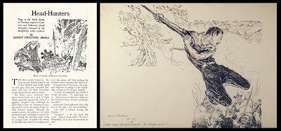
The other drawing has the hand written caption “with every bit of his strength he swung out”, and “Headhunters p. 15” at the lower left. At first it appeared that this may have been drawn for the September 18th, 1919 issue of Adventure magazine; a story titled Head-Hunters and Gold was published, along with a different Neill illustration. But this was not the case, as Atticus soon found another tale. This was simply titled Head-Hunters, by Sidney Herschel Small, and was published in the June 20th, 1931 issue of Argosy. Once again a Neill drawing was used to illustrate the story, but this time I think it lacks the drama of the unpublished piece.
 
Far more dynamic than the sedate image showing natives filing through the jungle, the unused illustration pictures the hero swinging on a vine, about to attack the cannibals. In case of any doubt regarding its intended use, the handwritten caption precisely matches the printed moment in the story.


Sunday, September 3, 2023

Final Denslow

W. W. Denslow experienced many highs and lows during his life and career. High points certainly included his collaborations with L. Frank Baum, and the huge success of The Wizard of Oz on stage.
 
Profits from the show allowed Denslow to lease, then purchase, his own island in Bermuda, where he worked on other projects. His 1904 book The Pearl and the Pumpkin uses the ocean around the islands in its plot; Denslow even slipped in a drawing of his own island. 

But health problems and alcohol issues plagued the artist, and by 1910 the island had been sold. Denslow was primarily illustrating advertising booklets for various companies, a fall back to something he did earlier in his career. But in 1915 a new opportunity beckoned - Denslow designed a cover for Life, the popular humor magazine, which was accepted and due to be published on their July 15th, 1915 issue. Delighted to have landed this prestigious job, Denslow used the profits from the sale of the drawing for a spree, ending in the hospital where he died of pneumonia on March 29th, before the magazine was even published.

The cover illustration is a colorful and delightful drawing, showing the artist hadn’t lost his ability to create fanciful images. It brings to mind the work of John Held Jr., the artist whose drawings would come to typify the 1920s, and who was just becoming recognized in his own career. 


In Denslow’s drawing a fashionably dressed woman laughs at a carved Egyptian image showing the costume of an earlier day, declaring it “How perfectly absurd!” But when looked at with a closer eye, it’s clear that the 1915 fashion is not much different than that from antiquity!


Sunday, August 27, 2023

Denslow Compilations

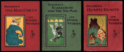
Eighteen picture books were written and illustrated by W. W. Denslow in 1903 and 1904, and published by the G. W. Dillingham company. The series proved popular, and the stories were also released as three hardcover books, each containing 6 stories. Several years later, ca. 1913, the books were reissued by the Donohue company; a reprint house specializing in cheaper editions. I have the Donohue versions of the three books, and it’s interesting to compare the printing of the illustrations in these copies to the original Dillingham printings.
 
The Dillingham versions present the stories in a sophisticated color range. Denslow's carefully considered palette of soft tones of orange, turquoise and olive green has been replaced in the Donohue editions with a more standard red/yellow/blue selection. This, combined with a pulpier paper of lower quality, creates murkier images and removes the cosiness of the muted color tones in the original printings. Presumably the brighter inks were thought to have greater appeal for the child readers. I prefer the original colors, which reflect Denslow's original choices.
 
In this example from Old Mother Hubbard, the new color scheme upsets the balance of the drawing. The blue background may be more colorful, but it overpowers the rest of the image, making the dog more difficult to see.

This page from Tom Thumb shows the poor effect of the new coloration. The colors are dark and unfriendly, calling too much attention to the drawing compared to the text.

And this wizard from Tom Thumb turns a bit garish in his diagonal stripes; the harmony of color seen in the original version is lacking, particularly against the newly dark background.

Finally, even our old friend the Scarecrow suffers in
this drawing from The House That Jack Built. As with the other examples shown, the darker colors make Denslow's masterly line work difficult to see, and the entire image suffers in consequence.
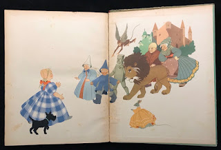
Donahue published editions of several other Denslow books, including The Wizard of Oz, all of which suffered in the print quality of the illustrations.

Sunday, August 13, 2023

My Dear Mr. Neill (Part 3)

Click here for Part 1 of this article 

Click here for Part 2  of this article

Marie Lufkin succeeded in commissioning a large Oz painting from John R. Neill, to hang over the fireplace in her new living room. At the same time, a second smaller commission was placed; Neill was to design a bookplate for the Lufkins.

On the back of one of the sketches for the fireplace painting is a rough pencil drawing for the bookplate design. The figures of the Scarecrow and Tin Man are shown carrying piles of perilously stacked books, which are starting to topple. There are a couple drafts of lettering for the inscription, and of course Marie had input on this design:

   About the book plate. The only thing is that I would like it rectangular and to have the inscription "Marie and Elgood Lufkin - their book". Don't you think that that is sufficient? I don't think it is necessary to have "The Land of Oz" anyplace, do you, as that will be understood by the characters drawn -? However, you decide about that, as you know best, and I know that whatever you do will be perfect.

In a letter from November 4th, 1936, Marie thanked Neill for the finished fireplace painting, and went on to say:

We love everything you have done for us and we appreciate your kindness and friendship more than I can ever tell you. 

I am enclosing one of the finished bookplates. Aren't they keen? - We're crazy about them.  

The image on the finished bookplate is reversed from the sketch, with the characters enclosed in one of Neill’s fanciful and detail-filled borders. The cost of the drawing for this piece was $50.


A couple years later Neill designed a holiday card for the couple, for the year 1939-1940. The artist drew a picture of the Lufkin's living room, complete with Oz painting over the fireplace, and Oz characters dancing before the fire. The fire itself has been colored red, by hand.

The card is large, a full 8.5" x 11", and contains a holiday greeting hand-lettered by Neill. The artist was no stranger to designing holiday cards, as he had drawn his own family cards for a number of years (see post). This card was quite a change from the small Christmas note the Lufkins had sent to Neill the previous year!
The Lufkins obtained a variety of other things from Neill over the years, including a second, smaller, original Oz painting. This was designed by the artist for an antique shop owned by Marie, appropriately called The Land of Oz Antique Shop. 

After Neill's death in 1943, Marie sent a letter of condolence to his widow:

Dear Mrs. Neill:

I just heard of Mr. Neill's death this morning and I wanted to write you immediately to tell you how badly we feel for you and yours and the great loss his death will be to all.

I only met Mr Neill once, as you know, but I really feel that I knew him so well and I was very fond of him.

Elgood and I send you and your family our deepest sympathy and be assured that you will be constantly in our thoughts and prayers. 

Always sincerely

Marie Murray Lufkin

Monday, August 7, 2023

My Dear Mr Neill (Part 2)

 
About a year ago I blogged about the start of the relationship between the Lufkin family and Oz illustrator John R. Neill. Letters from Marie Lufkin to the artist show the progress of the connection, and how the friendship resulted in the building of a unique collection of the artist's work.
 
Marie was persistent in applying to Neill for artwork, particularly for the watercolors used in The Emerald City of Oz. After learning that he didn’t actually own any of those pieces, she commissioned the illustrator to create a large new Oz painting. This was to hang over the fireplace in the living room of the Connecticut farm that the Lufkins were renovating. I particularly like this note from Marie, which was enclosed in a letter dated July 21st, 1936. It details her ideas for the design of the painting:

I think the panel should have a border around. Don’t you?

 As you know my favorite characters are the Scarecrow, Pumpkinhead, the Wizard, Dorothy, Ozma & Glinda, the Tin Woodman, Toto, the Cowardly Lion & the Hungry Tiger, Tick-Tock. (sic)

She was fairly comprehensive in her character list!

The back of the page also has a sketch showing the size for the painting, and indicating how it would be placed above the fireplace. 

The letter that was included with the note brings up the apparently embarrassing question of what the painting would cost:

It's a very ticklish subject Mr Neill, and I hate writing or talking about it, when you were such a wonder to say that you would do it - but I have to - How much money will it cost? Now it's out and I'm relieved - It's been worrying me for weeks how I could ask and I guess the simplest way is the best.

Once that ticklish question had been answered, the work began in earnest. A letter from August 14th reads:

Dear Mr. Neill -

I loved talking to you the other night and was delighted to hear that you are really on your way with "our Oz painting" - It sounds gorgeous & El & I both loved your idea of the Cowardly Lion & the Hungry Tiger leading the procession - DO send me a sketch of it soon - I can hardly wait to see it!

Neill created a number of color sketches for this project, in various sizes and degrees of finish. I have three early rough drafts, trying out layouts, character placement and color schemes. Eventually a more finished piece was sent to the Lufkins for their approval, and finally the actual painting was completed.
 
The finished artwork was shipped on October 10th, 1936. The shipping bill reveals the answer to Marie Lufkin's "ticklish question"; a value of $150 is listed for the final painting. 
 
Marie was thrilled with the piece and in a letter dated November 4th, 1936 she thanks Neill for the painting:

The painting is just too perfect and makes the living room. We are going to put a very light yellow wash on the walls - How do you think that sounds? Also Venetian blinds & I have not decided on the chintz - It sounds finished doesn’t it? Well it is, in my mind, but you should see the room actually! At the present moment there is a buzz saw going at top speed. Shavings all over the floor & carpenters banging away.
 
 She also says:

Of course I wanted you to send me a bill, and I want to thank you for being so generous and thoughtful with your work. As soon as our addition is finished Elgood and I want you and Mrs. Neill to come up for a night. You would wouldn't you? We're not a bit sporty as you know, so you wouldn't have to do anything you didn't want to and we'd love to have you both.

It doesn’t appear that Neill ever did make it up to the farm. I believe Marie only met him in person once.

When the house was sold in later years, the painting was removed by the family and preserved. A page from the prospectus for the house sale shows the living room, with the Oz panel still in its original location (image courtesy of Brady Schwind).

Monday, July 10, 2023

Italian Oz


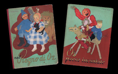
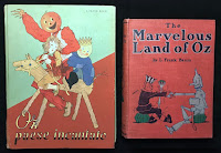
As a collector, I really haven’t branched into the large field of foreign editions of the Oz books. But there are a few examples that I haven’t been able to resist. A couple weeks ago I featured two early British editions; here are two Italian versions of Oz tales, published around the time of the release of the MGM film. These are oversized volumes, larger than the American versions of the stories. They are charming books with lovely line illustrations printed in two colors, as well as full color plates, by Miki Ferro Pelizzari.
 
These examples are the first two titles in the series, The Wizard of Oz and The Land of Oz. This copy of the Wizard is a later printing with a cloth spine. The original printing was issued with a paper spine, like that seen on the copy of Land. I’ve mentioned my dislike of fragile paper spines in the past….
 
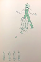
A fun detail in this Italian version of Land of Oz, pointed out to me by Atticus Gannaway, occurs after Jack Pumpkinhead and the Scarecrow meet. Rather than adjourning to the courtyard to play quoits, as in the original book, they play skittles! I knew it was a good game for Oz (see http://theozenthusiast.blogspot.com/2022/11/anyone-for-skittles.html ).
 
Five of the original six titles were published in this series. For some reason, the publishers decided to skip Dorothy and the Wizard in Oz!

Monday, July 3, 2023

Shirley Temple Land

Here’s a pair of fun items I recently picked up; two costume designs from the Shirley Temple television production of The Land of Oz.

Shirley Temple had a long association with Oz; as a child, she was a fan of the book series. When MGM made the 1939 film version of The Wizard of Oz, it was rumored that Shirley was to be lent to the studio to star as Dorothy. Of course this didn’t happen, but in 1960 the Shirley Temple Show produced a version of The Land of Oz on NBC TV, starring Shirley as Tip/Ozma. 

The show is a loose adaptation of L. Frank Baum’s second Oz book, and one of the few examples of a presentation of a later Oz story. Jonathan Winters played Lord Nikidik, one of the villains of the piece, and these are designs for his two costumes. Fabric samples for each outfit are still attached to the drawings.

The first drawing shows the suit worn by Jonathan Winters as Lord Nikidik at the opening of the story; the drawing bears the notation Radiant Violet - perhaps a name for the outfit? I've attached a couple rather blurry screen captures of the final costume in use. Agnes Moorehead, as the witch Mombi, is also shown. Apparently her performance in this role led to her playing another witch a few years later, Endora on Bewitched.

 The second design is for the uniform worn when Lord Nikidik tries to overthrow the Emerald City; this one is noted Potent Purple. The fabrics for the coat and pants that are attached to the drawing are both white, with a note that they are to be dyed to match a different fabric swatch.

The costumes were designed by Robert (or Bob) Carlton, who did quite a bit of television costume work from the 1950’s into the 1980’s.

Sunday, June 25, 2023

Early British Wizards

The Wonderful Wizard of Oz was first published in 1900 with great success, and around 1906 the first commercial British edition of the book appeared. Although this version was published by Hodder & Stoughton in England, it is essentially the same as the American Bobbs-Merrill edition from the same period, featuring W. W. Denslow’s two-color text illustrations and 16 color plates. 

But the cover colors are different, making a lighter and brighter book, which seems more appealing for a children’s story. Instead of deep olive green cloth stamped in black and orange, the British edition is bound in a lighter green textured cloth, and stamped in peach, black and dark green. The size of the book is also just a touch larger.

The title page shows both the Bobbs-Merrill imprint, which is part of the hand-lettered artwork, and an additional Hodder & Stoughton identification. Relatively few copies have turned up over the years, making me wonder how much of a success this book was with the Brits!

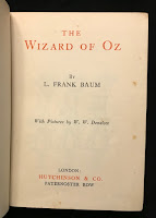
Around 1926 another edition was published, this time by Hutchinson & Co. As before, the book has the general appearance of the contemporary Bobbs-Merrill version; but it’s a much smaller book.

It’s almost a miniature, being only 5” x 7”, with far fewer of Denslow’s illustrations and no color plates. Perhaps this was done as a tie-in to the Larry Semon film version of the story, which was released in 1925. Semon was quite popular in Europe, particularly in France.

 The rather plain title page is printed in two colors, and lists Hutchinson & Co. as publishers. Hutchinson would go on to print later editions of the book, including the more elaborate version published to tie in with the release of the MGM film in England.

Monday, March 27, 2023

More Macaronis

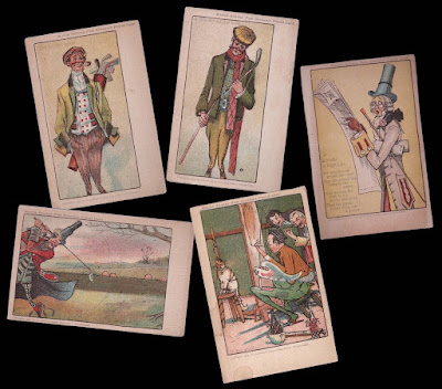
 Last summer I posted some postcards, from John R. Neill’s series of comical drawings titled Life Among the Macaronis. Since then I’ve picked up two additional cards in the set.

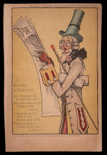
A Scandal in High Life is an image I've seen before. A dapper Macaroni is shocked to read in the paper that his grandfather was a draper! An added feature of this card is the verse, written by Neill, that tells the story explaining the gentleman's shocked expression; the other cards in the series just have titles. The series of golfing cards I previously posted all used cropped images, and this card has also been cropped from the original 1904 Sunday Magazine page.

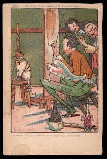
In the Studio is a card I haven't run across before. Here we have an artist working away at his easel, painting a cat. But the poor animal has been completely trussed to the stool it sits upon, to prevent escape! Two gentlemen observe the painting process. This drawing includes typical Neill touches in the elaborate wine bottles and small glass. I would assume that this has also been cropped from a larger drawing.

This brings the total so far to five cards in this series. I don’t know if this is the entire set, or if there are more waiting to be discovered!