Welcome to my blog, featuring various pieces from my collection of Oz books, artwork and memorabilia!
Showing posts with label Book. Show all posts

Monday, October 21, 2024

Neill's Bride Book

 I’ve posted in the past about The Bride Her Wedding Book (see here), a lovely little volume illustrated by John R. Neill in 1914, and published by the Reilly & Britton Co. I’ve picked up a few variations of the book since then, showing a couple different binding styles.

The most elaborate seems to be this, a book bound in a pictorial leatherette of some sort. The cover image of orange blossom is different from any of the other bindings I've seen, and the page edges are gilded. The blossom design is taken from a watercolor, presumably by Neill; the lettering is certainly his. This copy also includes the loose certificate that was originally inserted in the book, to be filled out by the wedding officiant.

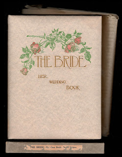
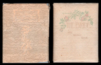
Next up is this, sold as the “Board Edition”. This book has a padded vellum cover with a lovely drawing of roses, printed in color. This is definitely a Neill drawing - in fact they’re the same roses used on the wedding certificate - and the same lettering from the previous version is used, though in a different arrangement. This copy includes its original striped glassine dustwrapper and cardboard box. It’s interesting to note that the title on the box is The Bride Her Own Book, a slightly shortened version of the cover title. The certificate is present in this copy as well.

Here we have another version, this time the “Cloth Edition”. The book is bound in a fine grey cloth over beveled boards, and another new design is on the cover. This time it’s a single rose, stamped in gilt, with a re-designed title. This copy also retains its dustwrapper and box; the glassine wrapper has a moire pattern, and the box is considerably thinner due to the flat, rather than padded, covers of the book.

When the publisher changed their name to Reilly & Lee, the same basic design continued to be used. The cover is now a cream colored cloth, and the boards are no longer beveled. It’s still a lovely little book, but less luxurious, and by this time the printing of the finely detailed illustrations is a bit less sharp.


I believe there is at least one other variation of this cover. It appears to be bound in a glossy white textured cardboard, using the same imagery as above. The poor photo shown is from an old auction listing. With any luck I’ll run across one of these someday and learn more details!

The simple certificate that was included with the volume is shown on the right.

Sunday, September 29, 2024

Baum's Mother Goose

Mother Goose in Prose was the first book I read by L. Frank Baum that was not an Oz book. It's a collection of charming "explanations" of Mother Goose rhymes, filling in gaps and turning the familiar tales into fleshed-out accounts. Sometimes the explanations feel a bit forced, but it's still a fun collection of short stories!

In the mid-1970's there was a burst of popularity for the work of Maxfield Parrish, and I was given a copy of the 1974 edition published by Bounty Books. The popularity of Parrish can be seen by comparing the large elaborate font used for his name on the cover to the much smaller, plainer font used for the author. The original edition didn't even mention Parrish on the cover, but his distinctive artwork may have been advertising enough!

Mother Goose in Prose was the first book illustrated by Parrish, as well as L. Frank Baum's first published children's book. I recently added a later edition to my collection, the last Bobbs-Merrill printing of the title. This was in publication between the 1920's and 1940's.

I find these two versions to be the most attractive printings of this book. The first edition, published by Way & Williams in 1897, is an oversized book with a bold cover printed with a color Parrish image that isn't used within the book itself. The same image is repeated on the rear cover, turning the entire book into an advertising poster. The Bobbs-Merrill edition is reduced to the standard size of an Oz book, but the cover is unique for adding color to one of the illustrations Parrish drew for the interior of the volume. Both are eye-catching, and cry out to be picked up and looked at.

In the original edition the pages are large and well printed, making the most of the detailed illustrations. The later version adds a fun touch by printing the pictures in red on a yellow background, but the print quality is not quite as good. Incidentally, the illustration shown (for The Three Wise Men of Gotham) was printed on an angle in the original edition, giving the image a added dynamic. It was straightened for all editions after that.

Sunday, August 27, 2023

Denslow Compilations

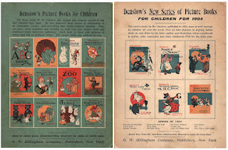
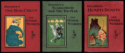
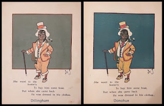
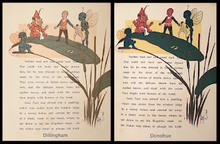
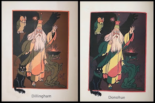
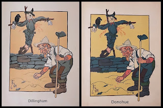
Eighteen picture books were written and illustrated by W. W. Denslow in 1903 and 1904, and published by the G. W. Dillingham company. The series proved popular, and the stories were also released as three hardcover books, each containing 6 stories. Several years later, ca. 1913, the books were reissued by the Donohue company; a reprint house specializing in cheaper editions. I have the Donohue versions of the three books, and it’s interesting to compare the printing of the illustrations in these copies to the original Dillingham printings.
 
The Dillingham versions present the stories in a sophisticated color range. Denslow's carefully considered palette of soft tones of orange, turquoise and olive green has been replaced in the Donohue editions with a more standard red/yellow/blue selection. This, combined with a pulpier paper of lower quality, creates murkier images and removes the cosiness of the muted color tones in the original printings. Presumably the brighter inks were thought to have greater appeal for the child readers. I prefer the original colors, which reflect Denslow's original choices.
 
In this example from Old Mother Hubbard, the new color scheme upsets the balance of the drawing. The blue background may be more colorful, but it overpowers the rest of the image, making the dog more difficult to see.

This page from Tom Thumb shows the poor effect of the new coloration. The colors are dark and unfriendly, calling too much attention to the drawing compared to the text.

And this wizard from Tom Thumb turns a bit garish in his diagonal stripes; the harmony of color seen in the original version is lacking, particularly against the newly dark background.

Finally, even our old friend the Scarecrow suffers in
this drawing from The House That Jack Built. As with the other examples shown, the darker colors make Denslow's masterly line work difficult to see, and the entire image suffers in consequence.

Donahue published editions of several other Denslow books, including The Wizard of Oz, all of which suffered in the print quality of the illustrations.

Monday, July 10, 2023

Italian Oz


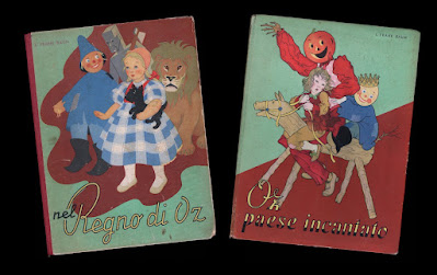
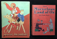
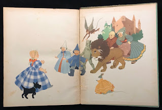
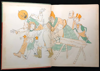
As a collector, I really haven’t branched into the large field of foreign editions of the Oz books. But there are a few examples that I haven’t been able to resist. A couple weeks ago I featured two early British editions; here are two Italian versions of Oz tales, published around the time of the release of the MGM film. These are oversized volumes, larger than the American versions of the stories. They are charming books with lovely line illustrations printed in two colors, as well as full color plates, by Miki Ferro Pelizzari.
 
These examples are the first two titles in the series, The Wizard of Oz and The Land of Oz. This copy of the Wizard is a later printing with a cloth spine. The original printing was issued with a paper spine, like that seen on the copy of Land. I’ve mentioned my dislike of fragile paper spines in the past….
 
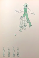
A fun detail in this Italian version of Land of Oz, pointed out to me by Atticus Gannaway, occurs after Jack Pumpkinhead and the Scarecrow meet. Rather than adjourning to the courtyard to play quoits, as in the original book, they play skittles! I knew it was a good game for Oz (see http://theozenthusiast.blogspot.com/2022/11/anyone-for-skittles.html ).
 
Five of the original six titles were published in this series. For some reason, the publishers decided to skip Dorothy and the Wizard in Oz!

Sunday, June 25, 2023

Early British Wizards

The Wonderful Wizard of Oz was first published in 1900 with great success, and around 1906 the first commercial British edition of the book appeared. Although this version was published by Hodder & Stoughton in England, it is essentially the same as the American Bobbs-Merrill edition from the same period, featuring W. W. Denslow’s two-color text illustrations and 16 color plates. 

But the cover colors are different, making a lighter and brighter book, which seems more appealing for a children’s story. Instead of deep olive green cloth stamped in black and orange, the British edition is bound in a lighter green textured cloth, and stamped in peach, black and dark green. The size of the book is also just a touch larger.

The title page shows both the Bobbs-Merrill imprint, which is part of the hand-lettered artwork, and an additional Hodder & Stoughton identification. Relatively few copies have turned up over the years, making me wonder how much of a success this book was with the Brits!

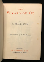
Around 1926 another edition was published, this time by Hutchinson & Co. As before, the book has the general appearance of the contemporary Bobbs-Merrill version; but it’s a much smaller book.

It’s almost a miniature, being only 5” x 7”, with far fewer of Denslow’s illustrations and no color plates. Perhaps this was done as a tie-in to the Larry Semon film version of the story, which was released in 1925. Semon was quite popular in Europe, particularly in France.

 The rather plain title page is printed in two colors, and lists Hutchinson & Co. as publishers. Hutchinson would go on to print later editions of the book, including the more elaborate version published to tie in with the release of the MGM film in England.

Wednesday, February 22, 2023

The Perils of Paper Spines

As a book collector, I've always found paper spines to be completely impractical; especially on children's books, which were never meant to be handled with care! The fragile paper is easily rubbed and torn, and more often than not large chunks will be missing at the top and bottom of the spine; but it was a less expensive alternative to cloth for binding a book, and presumably helped to lower the cost of children's books while raising the profits.

A number of the books illustrated by W.W. Denslow were published in this fashion. His first big success with L. Frank Baum from 1899, Father Goose His Book, was published by George M. Hill in paper covered boards with a paper spine. In spite of the book's huge success, a more enduring binding was never used on any of the later editions, even when publication was taken over by Bobbs Merrill. The example shown above has its full spine, but it’s not at all unusual to find copies of the book like the photo on the left, with several inches gone from either end of the spine, or even the entire spine missing.

The follow up volume, The Songs of Father Goose, was also published in paper covered boards, but did have a sturdier cloth spine - until a new edition was printed by Bobbs Merrill, with a new cover design and paper spine. The paper spine on the copy shown in the photo below has been replaced.
Denslow's hit book from 1901, Denslow's Mother Goose, is another example of this fragile style of binding. Early copies were bound with paper spines, but the publisher McClure seems to have quickly changed this to a much sturdier cloth spine. I wasn't aware of the paper spine version until I stumbled across one recently - the bottom of the spine is missing 2 inches, which I've adjusted in the photo. The small advertising card shows the original cover design with paper spine, with the title printed in black and Denslow's seahorse logo printed in brown - the cloth spine version is simply printed in black.
In 1902, Denslow's Night Before Christmas was published by G. W Dillingham. Once again, the publisher chose to use a binding of paper boards and paper spine. In this case, Denslow’s design for the cover takes advantage of the format, with a large image of Santa in his sleigh that spreads across the spine and rear board. But copies today are rarely found with the spine intact, destroying the concept. The book quickly switched to a cloth binding with a new cover design for later printings.
The last major children's book illustrated by Denslow was also bound in paper boards, with a paper spine. Consequently The Jeweled Toad, from 1907, is another title that is difficult to find with a spine in nice condition. This was also published by Bobbs Merrill - they do seem to have liked their paper bindings!
Fortunately the most famous Baum/Denslow title, The Wonderful Wizard of Oz, was given the full cloth treatment it deserved in 1900. The same is true of Dot and Tot in Merryland, from 1901. When Dillingham published The Pearl and the Pumpkin in 1904, and Billy Bounce in 1906, they were given full cloth. In 1909, Century published When I Grow Up, bound in cloth. But those early paper spines do add another degree of difficulty to the collecting game!

Friday, November 4, 2022

Pearls and Pumpkins

 This past weekend Irwin and I visited the Kerlan Collection, at the University of Minnesota, to view the W. W. Denslow materials in their collection. We were accompanied by Brady Schwind, who was doing some research for his Arts of the Imagination Foundation. I’ve been to the Kerlan a number of times over the years, but it’s always fun to revisit and view interesting materials.

Among their Denslow holdings is the publisher’s dummy for The Pearl and the Pumpkin, written by Denslow and Paul West, and published by G. W. Dillingham in 1904. This is a fascinating piece, showing how the layout of the final book was developed. Proofs of illustrations are cut and pasted in place on blank pages, to figure out the spacing and typesetting of the final book. 

In the above image, the dummy title page is shown on the left, and a photo of the final title page is on the right. There's been a change to the credits; rather than "pictures by the Authors", the finished book credits Denslow alone, and stresses his past achievements.
One of the unusual aspects of the dummy is the color scheme used on the illustration proofs. In the final book, the drawings are printed in black and orange. But for this working copy, the illustrations were printed in turquoise and orange. The big difference is that the proof illustrations appear to have three colors, since the areas where the two colors overlap show as a deep olive green. In the published version, the use of black ink instead of turquoise means that the overlapping areas simply look black. It’s a shame the trial colors weren’t used in the final book!

Another interesting point is the endpaper design. In the dummy, Denslow has sketched an illustration of Pearl and Joe, (the pumpkin), surrounded by jack o’lanterns. The published book shows secondary characters with Joe, and Pearl has disappeared! The sketch in the dummy feels considerably livelier to me. The endpapers of the first printing of the book were printed in turquoise, which almost seems to be a holdover from the original turquoise and orange color scheme; but later printings changed to the orange and black inks that are used in the rest of the illustrations.

It was a very appropriate visit for Halloween weekend!

Monday, July 18, 2022

Denslow's Red Riding Hood

In December 1902, the comic section of The New York Herald published four adaptations of classic stories, rewritten and illustrated by W. W Denslow. These would be the genesis for the series of Denslow's Picture Books for Children, which were published by Charles Dillingham in 1903 and 1904.

Among these first stories was Little Red Riding Hood, adapted in poetic form and revised to eliminate horrors - in this case, Grandma subdues the wolf and he becomes as tame as a pet dog. This idea of eliminating nightmares from stories for children was common to both Denslow and L. Frank Baum; Baum writes of this concept in the introduction to his modern fairy tale, The Wonderful Wizard of Oz. As to how successful they were at achieving their goal is another question! 

At any rate, here is an original piece of the artwork from this story. Red Riding Hood is seated in a high chair as the newly domesticated Wolf begs for a treat. Various traces of preliminary pencil work can be seen, which is always an interesting part of viewing original artwork!

The drawing is cut from a larger sheet, and mounted on a backing piece. I seem to remember hearing that some of Denslow’s newspaper comic drawings suffered water damage many years ago, while in the possession of a book dealer. Consequently, what could be salvaged was cut from the various pages for later sale. At least the artwork was not entirely scrapped!


Sunday, July 3, 2022

Christmas in July

Reilly & Britton published The Christmas Stocking Series in 1905, and it proved to be a popular item. The series of six small books continued in print into the 1920s, utilizing several different packaging formats. I recently picked up one of the early variations.

This particular version  pairs two of the books together in a titled box. The books were published with red, burgundy, green, or blue cloth spines and back covers - these copies have the blue cloth. 

The series is of interest to Oz fans because of the introduction, written by L. Frank Baum and used in each small book. This short essay tells the origin of the Christmas stocking, and was written specifically for this series. It was well promoted in publicity for the books, and provided a good selling point.

Another later variation, ca. 1913, was the steamer trunk box; I've shown this before but here it is again for comparison. All six titles were housed in a fanciful cardboard trunk, covered in whimsical travel labels. The bindings of the books had changed by this time, to red boards with a green holly design. This packaging remained in use into the 1920s.