American Fairy Tales, from 1901, is a collection of short stories written by L. Frank Baum, with some distinctly American attributes. The stories are a mix of different styles, but in general Baum designed his stories for American children, using elements that would be familiar to them, rather than settings of long ago and far away.
This book was illustrated by four artists, three of whom worked on other books by Baum - the title page and borders were by Ralph Fletcher Seymour, who lettered Father Goose, His Book; Ike Morgan, who illustrated The Wogglebug Book, provided the majority of the illustrations; Harry Kennedy, who illustrated the Army and Navy Alphabets, also drew a few; and N. P. Hall did drawings for one story. It's tempting to think he might be related to H. Putnam Hall, who illustrated the first edition of Annabel. Hall's two pieces are the least of the batch - overall, it's a bit of an odd mix. In 1909 these stories, together with a few more, were published as Baum's American Fairy Tales, by the Bobbs-Merrill company. This edition had new illustrations by George Kerr.
First editions of this book really do seem to have suffered more wear than most Baum titles. I've seen a fair number of absolutely awful copies. Apparently the book was originally sold boxed, but I haven't heard of any surviving boxed copies - they could be out there!
Thursday, July 31, 2008
Wednesday, July 30, 2008
Yellow Knight and Pirates in Oz
As I get further along in the Oz series, I'm finding I have less to call out about some of the actual books. The format of the titles stayed consistent for a number of years, and I don't mean to do plot summaries for each one. So, I'm doubling up a couple to help fill space!
The Yellow Knight of Oz, from 1930, brings another of Ruth Plumly Thompson's boy characters to Oz. This time it's Speedy, a boy very similar to Peter. We'll meet him again in his own book. I've always felt this story, which I enjoy, is not completely successful; the solution to the mystery at the center seems so very obvious.
Pirates in Oz, from 1931, introduces another classic Thompson character - Captain Salt, a gentle pirate who would rather explore and collect specimens than conquer. Peter from Philadelphia is back for this story, along with Ruggedo the Gnome King, the perennial Oz villain.
Ruggedo never seems to be truly finished off, regardless of how many times Ozma enchants or banishes him. This is a stark contrast to the removal of Mombi at the end of Lost King of Oz. As was pointed out in the comments on my posting for that book, Ozma simply has Mombi melted at the end of the story - she's not coming back!
I think John R. Neill's lettering for the book titles through the 1930's is so evocative of their time period - the modern touch together with the fantasy images is great!
Tuesday, July 29, 2008
Neill Adventure Art
John R. Neill did a lot of work for adventure story magazines - particularly Argosy Magazine, and others of the same sort. Here I have two drawings that could have been used in magazines of this type. I don't know where these pieces were actually published.
The drawing of the man swinging on a vine has the caption "Head Hunters /p. 15/ "With every bit of his strength he swung out." This is a lively action image, and includes some of Neill's stereotypical savages - just for the record, Neill also produced very sensitive drawings of various races.
The second drawing is captioned "Off Finistere", and shows a man on deck signaling with flares. This drawing makes me think of some of the illustrations of magical happenings in the Oz books - something about the sparks flying!
Both of these drawings are shaped to fit around text on the published page.
Update: Thanks to research by Atticus Gannaway, I have found that both these drawings are unpublished. The headhunter drawing was drawn for a story published in Argosy, June 30, 1931, titled Headhunters and Gold. The other was drawn for a story in Adventure magazine titled Off Finisterre, published Feb. 15, 1929. In both cases, Neill drew other illustrations that were published with the stories.
Monday, July 28, 2008
Oz at School
Here are a couple school-related Oz pieces from the 1920s. This was a popular time for the Oz series, and it's fun to see the influence of the books spilling over into the classroom.
The notebook is from the Famous "Oz" Series, published by White and Wyckoff; This was produced as a set of six - I think I've seen two other copies from this set. They've all used color plate illustrations from The Tin Woodman of Oz on their covers - in this case, the Scarecrow and the Tin Woodman who have been changed into a tin owl and straw stuffed bear. The interior is simple lined paper, and the rear cover has a blurb telling a bit of the story and promoting the Oz books. My copy has been used on the first few pages by a student for some sort of assignment or test that appears to be unfinished - I'd say it wasn't their lucky notebook!
I've seen a couple versions of the seating poster, using different color schemes and photos. The basic information is the same, but the layout of drawings and type varies. These were produced by The American Seating Corp. Obviously the Oz characters were considered familiar enough to help sell products!
Sunday, July 27, 2008
Evelyn Copelman
I grew up with the 1944 edition of The Wizard of Oz, illustrated by Evelyn Copelman. I think this was the first unabridged edition to use new illustrations, and the title page claims that they were based on the original W. W. Denslow drawings. I think the MGM film had a stronger influence on the drawings than anything else, and some incidents are independent of any influence. A later edition added more illustrations to the book. I used to get this version out of the local library frequently, much to the confusion of my family. I don't think they realized the reason - more pictures!
When I first saw the original Denslow illustrations, they struck me as very odd - I was so used to this version of the story. I still have the original copy that I read; it was already worn by the time I got it, and is now a pretty decrepit book.
Copelman also illustrated a new edition of The Magical Monarch of Mo. Both of these titles were published by Bobbs-Merrill, who still had the rights to a number of Baum's early titles.
Saturday, July 26, 2008
Enchanted Island of Yew
The Enchanted Island of Yew, from 1903, is one of L. Frank Baum's less "Americanized" stories. As with Queen Zixi of Ix, I think this tale has more of a long ago and far away sensibility, and is a bit more European in style.
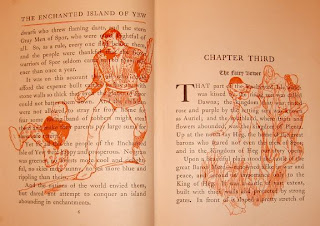
This book was illustrated by Fanny Cory, who also illustrated The Master Key. For this title, Bobbs-Merrill tried a different approach. There are 8 full color plates, but the text illustrations are printed in orange under the actual text. It's a fun look for the book, but the drawings are difficult to distinguish - I'd much prefer to see them on their own.
M.A. Donohue publishers re-used the cover design from this title for another book, a collection of stories and fairy tales. I ran across one in a small antique mall once and was quite surprised to recognize the cover - since then I've seen a copy of it featured in the Baum Bugle. I had passed up the copy I saw, as it was in pretty rough condition!
Friday, July 25, 2008
An Oz Relic?
I'm sorry to say I've only ever made it to one Oz convention, and that was an Ozmopolitan convention about ten years ago in Wisconsin. I didn't get to attend the whole weekend, but was there for the day on Saturday and enjoyed myself - having read about the conventions for years, I was happy to see one in person.
One of the Saturday highlights, of course, is the Oz auction. I didn't have much luck at the auction, but did come away with one unique item - in a fit of desperation (perhaps?), I bought Dick Martin's typewriter. ?Why? I would never be able to say, but it was there and no one was bidding - and I must have been carried away by the moment. Anyway, a few dollars later it was mine and has been residing in my basement ever since! There are no signs of his ownership, and I couldn't say if he ever even used it - although it's clear that someone did.
Among his many Oz-related projects, Dick Martin did write and illustrate one Oz book. The Ozmapolitan of Oz was published by the International Wizard of Oz Club and is currently available in a new edition.
Thursday, July 24, 2008
Del Rey Jack Pumpkinhead
Here we have Jack Pumpkinhead crossing a chasm by means of a magic beard. This painting by Michael Herring for the Del Rey edition of Jack Pumpkinhead in Oz, gives us another exciting scene of Oz antics.
In this case, Herring isn't following the text as closely as possible - the beard should be wrapped around a tree, and Jack should be pulling himself across. John R. Neill illustrated a couple variations of this scene in the original book.
One of the things I really enjoy in Herring's paintings are the skies. I may have mentioned this before, but they really do add to the sense of enchantment in the images - particularly when they are presented in such Ozzy colors as this. In this case, the pink/lavender sky would be appropriate for either the northern Gilliken country, or for the southern Quadling country where this incident takes place.
Wednesday, July 23, 2008
Denslow Bindings
I've realized that when posting the various W. W. Denslow covers designed for Rand McNally, I've only been showing the cover itself. The decoration extended to the spine of the book as well, and often continued onto the back. In some cases it was a complete wrap-around design. On the right are some of the spines of titles I've shown. The decorations are eye-catching and colorful, which naturally was what the publisher wanted.
The rear covers often had a smaller emblem of some sort relating to the story, or possibly a small decoration which continued the cover theme. On the left is the rear cover of The Fifth of November, featuring an executioner's mask and ax.
Tuesday, July 22, 2008
Jack Pumpkinhead of Oz
Jack Pumpkinhead of Oz, from 1929, brings Ruth Plumly Thompson's Peter back to Oz from Philadelphia. This book also introduces another of my favorite Thompson characters - Jinnicky, the Red Jinn of Ev. Jinnicky is a wizard, and his body is a red glass ginger jar. John R. Neill's one illustration of the character in this book is nothing like his later, much better interpretations.
For some reason, the fabric on first editions of this book tends to pucker, across the spine and rear cover. I don't know if the glue or sizing being used at the time was defective, but it's a condition I've noticed on most firsts that I've seen.
I have to admit, I always got a kick out of Jack's bell bottom pants. But then, he was always a stylish dresser!
Monday, July 21, 2008
Denslow Covers
This pair of W. W. Denslow covers for Rand McNally titles show two different approaches to cover design. For Marsa, the cover text is minimal and the image is basically a small four-color poster which holds the viewer's attention. This story is a semi-historical romance between a Hungarian prince and a Tzigana (gypsy/peasant girl), with a fateful letter thrown in to botch up the works - some of these elements are indicated on the cover.
The Fifth of November has a different style of cover - it also resembles a poster, but the text of the title and authors, together with small thistle and rose emblems, make up much more of the monochromatic decoration. The smaller image of Guy Fawkes and his barrel of gunpowder are there to balance the rest of the cover. I haven't read this title yet, but plan to in the near future.
I think Guy Fawkes bears a bit of a resemblance to The Bandit from L. Frank Baum's Father Goose, His Book. Perhaps they are related!
Sunday, July 20, 2008
Mary Louise
After finishing the series of Aunt Jane's Nieces books, L. Frank Baum began the Mary Louise series, using his Edith Van Dyne pseudonym. Baum took the title character's name from his favorite sister - there was also a Mary Louise in the book Annabel.
The Mary Louise books have the plainest bindings of any Baum title published by Reilly & Britton. Maybe the publishers felt that Edith Van Dyne was such a popular author, there was no need to spend money on attractive covers!
On the left I'm showing a first edition in dust jacket, a first without the jacket, and a Reilly & Lee edition in jacket from the early 1920's. The original dust jackets use the same image on all the titles, a flock of bluebirds in flight. The series was given the additional title of The Bluebird Books, for no apparent reason that I know of, unless it was to justify the bluebirds on the jacket! As you can see, the later Reilly & Lee editions used a new jacket design - once again the image is the same on all the titles, but the color in the background changes.
After Baum's death, the series was continued using another author - just as the Oz series was continued with Ruth Plumly Thompson.
Saturday, July 19, 2008
High Boy
For The Giant Horse of Oz, John R. Neill created page-and -a-half chapter title drawings. The gap in the middle of the drawing was to allow for the binding of the book, as the image appeared over two pages. This drawing is from chapter 13, and also has a blue watercolor wash to indicate areas where half-tone shading would be added. There is a lighter and a darker blue - for lighter and darker grey. It's not clear whether this color was added by Neill or by Reilly & Lee staff , but it's probably the latter.
I don't care much for the half tones - they add depth, but I think they tend to muddy the images, and would rather see the illustrations without the grey haze. This technique was used in a number of the Oz titles during this time period.
The drawing shows Trot, the Scarecrow and Benny (a living stone statue) gazing up through the legs of High Boy, the Giant Horse - a horse with telescopic legs. This is the only Neill drawing I have of the Scarecrow, and he's looking rather apprehensive!
Friday, July 18, 2008
Junior Editions
Several days ago I mentioned some 1939/1940 printings of a few Oz titles, generated by interest in the MGM movie. Here is another set of books that was produced at the same time. Rand McNally published these Junior Editions of six Oz books, as well as reprinting the six stories from the Little Wizard Series in 3 books. The Junior Editions are abridged versions of full size Oz books - the Little Wizard stories were originally written as short stories. All nine books were available in a boxed set, something that doesn't turn up very often!
This edition of The Road to Oz is unique, as this is the only printing to have color plates. The original book was printed on various shades of paper, and the publishers never bothered to add color plates when the paper feature was dropped. For this printing, 12 color plates were created from the original black & white drawings. It would be interesting to see a hybrid of these two printings - the book printed on colored paper, with the 12 color plates tipped in!
Thursday, July 17, 2008
The Giant Horse of Oz
The Giant Horse of Oz was Ruth Plumly Thompson's title for 1928, and with this book Reilly & Lee changed the format of Oz dust jackets. Up to this point, the jackets on the Thompson titles consisted of white paper with front and back panels reproducing the cover plate of the book, and a spine panel printed in blue with the book title, an illustration and the publisher's name. The front flap had a blurb for the story and the rear flap had a list of titles, ending with the most recent title. The information on the jacket didn't change, but from this point on through the rest of the series the spine was printed in color, creating a more colorful and attractive wrap around jacket.
This idea had been visited by Reilly & Britton in 1913 with The Patchwork Girl of Oz, and before that with Sky Island. In both of those cases, the elaborate dust jacket image was different from the book cover.
Wednesday, July 16, 2008
Denslow Atlas
Among the covers designed by W. W. Denslow for Rand McNally is this atlas, The World's Peoples and the Countries They Live In. This is a combination atlas and geography book, with many maps, photos and diagrams of various countries and their inhabitants. The cover is designed in quite a different style from the books I've been showing - it's a much more detailed drawing, rather than a bold graphic image. The size of the atlas allows for this approach, since there is plenty of room for detail and less necessity for simple blocks of color.
I'm afraid this image was somewhat inexpertly pieced together from two scans, as the book is too large for my scanner - but at least you get the idea!
Tuesday, July 15, 2008
More Christmas
Ruth Plumly Thompson and John R. Neill also provided a Christmas themed book, or at least a Santa themed book - The Curious Cruise of Captain Santa. This is the only title outside the Oz series that these two worked on together and it was published by Reilly & Lee in 1926.
I like the way that this book was printed throughout with red accents in the illustrations - it would have been nice to have full color plates as well, but I suppose that was out of the budget.
Monday, July 14, 2008
Christmas in July
As it's the middle of the summer, I figured it was time to present a few Christmas books. First we have The Life and Adventures of Santa Claus (1902), L. Frank Baum's story of the origin of St. Nick. In this book, Baum creates an entire mythology to help flesh out the Santa Claus legend - in some ways, it's similar to what he did in Mother Goose in Prose, starting with a traditional tale and making it his own. This book has been adapted into a couple different animated TV specials.
The illustrations are by Mary Cowles Clark, an artist from Syracuse, N.Y. I don't know if there are any surviving illustrations from this book. There are a few more examples of her work at:
http://www.nha.org/digitalexhibits/artistcolony/marycowlesclark.htm
Denslow's Night Before Christmas (1902) is exactly what the title says - W. W. Denslow's take on the classic Clement C. Moore poem. This was a follow up to Denslow's Mother Goose, and is in the same large picture book format. Denslow did a wonderful job of illustrating the poem, with his usual bold rich colors. The copy I'm showing is a first state, bound in paper covered boards. Later printings had a different, and much sturdier, cover. This book was reprinted in the 1980's - I'm surprised it hasn't been printed more often! I believe much of the artwork survives for this title.
Sunday, July 13, 2008
Del Rey Gnome King
I think this painting for The Gnome King of Oz is my favorite of the cover paintings done by Michael Herring for the Del Rey Oz books. There is something about the color and simplicity of the image that I really like. The Gnome King is shown soaring through the sky to the Emerald City, wearing a Flying Cloak of Invisibility (take that, Harry Potter!). The city is seen beneath the flying gnome, and the yellow hills in the background indicate that we must be gazing toward the Winkie country - originally in the west, but I don't recall at this point in the series if it was still in the west or had moved to the east. As I've mentioned before, compass points and countries have a way of shifting on maps of Oz.
John R. Neill did a drawing of this same incident for the original book. The image is very similar, but I do like the huge cloud Herring has placed behind the king. The Emerald City itself is adapted from the Neill illustration used on the original endpapers of Dorothy and the Wizard in Oz.
As with all the Thompson covers, this image was cropped for use on the published book, losing much of the landscape and sky. On these editions the printed cover images do extend over the spine of the book, which accounts for some of the extra finished area in the paintings.
Saturday, July 12, 2008
Stained Glass
My partner and I own a stained glass studio, (centurystudios.com) and over the years have done quite a few Oz related projects. We made panels that were sold by Books of Wonder for a number of years, but have also done independent projects for clients, or just for the fun of it. I'm showing two window projects we did in the past, the first being the portrait of Ozma from the endpapers of Emerald City of Oz, and the other a group image using elements from an Emerald City color plate and additional characters. These are always fun pieces to create.
Currently I'm working up the pattern for a window based on the Lufkin mural design, painted by John R. Neill - the image shown below is taken from Oz-Story #6, published by Hungry Tiger Press. This will be a larger window and should be a lot of fun when it's done - but that won't be for quite a while. As it's a personal project, it will have to be worked in around other things.
Friday, July 11, 2008
The Gnome King of Oz
The Gnome King of Oz was Ruth Plumly Thompson's 1927 Oz title. I've never liked the fact that the character was now the Gnome King, rather than the Nome King - the change occurred in Kabumpo in Oz. Admittedly, it does correct what could be perceived as a spelling error, but the character was originally named the Nome King and I think he should remain that way. Chances are, it was a publishers' decision rather than Thompson's own preference.
This book introduces Peter from Philadelphia, one of Thompson's boy characters, who returns in later Oz books as well. L. Frank Baum tended to send girls to Oz, Thompson sent boys - I suppose she may have been trying to balance things out!