In 1956, the copyright on
The Wizard of Oz expired. This gave Reilly & Lee, the publishers of the rest of the Oz series, their first opportunity to publish their own version of the book. But over the next ten years, their book would change repeatedly!
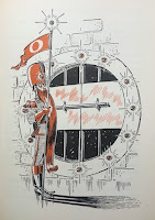
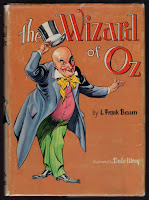
To start, a new edition of the book was set up with new illustrations by Dale Ulrey. This was a more elaborate Oz book than the publishers had produced in a while. Two-color illustrations, in rust and black, were printed throughout, and the front endpapers sported a full color map of Oz. This map had previously been featured in the 1954
Who’s Who in Oz, but in a slightly different form - and not in color! The book also had a dust jacket designed by Ulrey, featuring the Wizard himself. But by 1959, this jacket was replaced with a new design drawn by Roland Roycraft, who designed jackets for a handful of other Oz titles as well.
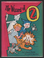
Perhaps the wizard wasn’t grabbing enough attention? The new design was quite bright with a hot pink curtain and cartoon-like images of Dorothy and her three friends. The endpaper map was gone, but the color work was still inside - my copy has the same rust and black color scheme of the earlier version. Then, in 1960 the jacket changed again, this time to a design by Dick Martin.
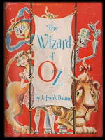
Martin’s
Wizard jacket is a clever concept. Not quite as childlike as the Roycraft jacket, this time we have a wraparound design showing Dorothy and friends on the cover - with the same image, shown from behind, on the rear cover. The interior of the book still features Ulrey’s two-color illustrations, but they have now been given four different secondary colors - blue, green, yellow and red - to tie in with the story (more or less), in the same way that the illustrations did in the original 1900 book.
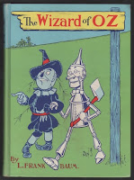
But this cover wasn’t destined to last either - in 1964 the entire book was given another overhaul, and most of the original illustrations by W. W. Denslow (printed in two colors) were restored. Dick Martin was responsible for the redesign, and this time the cover image was printed directly on the cloth of the book, in full color. The design chosen was based on a rare poster by Denslow, advertising the original edition, and a dust jacket was no longer part of the book. (Edit - according to Michael Hearn, the earliest copies of this book were issued with a glassine dust jacket.)
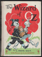
And then a year later the cover changed again! This time it was based on a Denslow drawing of Dorothy being carried from the deadly poppy field, with a white background and spine. The rest of the Baum titles were given new covers as well, creating what’s now known as the “white spine” edition. This final version was the last design used on the book by Reilly & Lee, and remained in use for the next ten years.

 To start, a new edition of the book was set up with new illustrations by Dale Ulrey. This was a more elaborate Oz book than the publishers had produced in a while. Two-color illustrations, in rust and black, were printed throughout, and the front endpapers sported a full color map of Oz. This map had previously been featured in the 1954 Who’s Who in Oz, but in a slightly different form - and not in color! The book also had a dust jacket designed by Ulrey, featuring the Wizard himself. But by 1959, this jacket was replaced with a new design drawn by Roland Roycraft, who designed jackets for a handful of other Oz titles as well.
 Perhaps the wizard wasn’t grabbing enough attention? The new design was quite bright with a hot pink curtain and cartoon-like images of Dorothy and her three friends. The endpaper map was gone, but the color work was still inside - my copy has the same rust and black color scheme of the earlier version. Then, in 1960 the jacket changed again, this time to a design by Dick Martin.
 Martin’s Wizard jacket is a clever concept. Not quite as childlike as the Roycraft jacket, this time we have a wraparound design showing Dorothy and friends on the cover - with the same image, shown from behind, on the rear cover. The interior of the book still features Ulrey’s two-color illustrations, but they have now been given four different secondary colors - blue, green, yellow and red - to tie in with the story (more or less), in the same way that the illustrations did in the original 1900 book.
 But this cover wasn’t destined to last either - in 1964 the entire book was given another overhaul, and most of the original illustrations by W. W. Denslow (printed in two colors) were restored. Dick Martin was responsible for the redesign, and this time the cover image was printed directly on the cloth of the book, in full color. The design chosen was based on a rare poster by Denslow, advertising the original edition, and a dust jacket was no longer part of the book. (Edit - according to Michael Hearn, the earliest copies of this book were issued with a glassine dust jacket.)
 And then a year later the cover changed again! This time it was based on a Denslow drawing of Dorothy being carried from the deadly poppy field, with a white background and spine. The rest of the Baum titles were given new covers as well, creating what’s now known as the “white spine” edition. This final version was the last design used on the book by Reilly & Lee, and remained in use for the next ten years.


1 comment:
It's so nice to see more content!
Post a Comment