Welcome to my blog, featuring various pieces from my collection of Oz books, artwork and memorabilia!
Showing posts with label Original art. Show all posts

Thursday, March 13, 2025

And One More…

Last week I featured two 1903 Oz costume designs that I found in a group of drawings by designer Caroline Siedle. They were clearly identifiable as pieces from that show, but there was another drawing that caused me to ponder possibilities. It’s unfortunate that Siedle’s costume designs do not tend to be clearly marked in terms of what show or character they were intended. Often it’s left to recognition of a costume, or a few small clues written on the drawing to help figure things out. I believe designs for specific shows were originally kept together in folders, but everything has been dispersed over the past century, requiring some detective work for identification. 


This particular piece has suffered some damage over the years, not an uncommon occurrence; these were working drawings that passed through a number of hands while a show was being created. The design caught my eye primarily because of the character’s hairstyle. At first glance it appears to be a hearty peasant woman, but there was something very reminiscent of a couple designs I have from Babes in Toyland, the show that followed the Wizard of Oz at the Majestic Theater in 1903. Specifically, it seemed very much like the hair of the lead character Alan.

Thinking about it, I began to wonder if this might be a design for Alan in Act 1. At the start of Babes in Toyland, Alan and his sister Jane are sent off on a sea voyage by their wicked uncle Barnaby, who has arranged for the ship to sink. They survive, and return home in disguise. Could this be Alan when he is disguised as the fortune teller Floretta?

 I’ve not been able to find any photos of that character, but some details made it seem possible - the tattered white blouse/shirt that could be the remains of Alan’s sailor outfit from the start of the show (the photo at right is from the NYPL Digital Gallery); also the general autumnal color scheme of warm red and green with touches of yellow fit in with other Act 1 designs. Another point was the word Chip written on the drawing; in later tours of the show, Alan was played by an actor named Sam Chip, known as Little Chip. Could this be another lost Toyland design?

So far this was all supposition with no backing. But the other designs I have from that show all have the original actors name written in the upper left hand corner on the reverse of the drawings. If this one were to be labeled with the name William Norris, I would be confident that I’d found the design for Floretta.

Once the drawing arrived and I could examine the back, my guess was proven - in the upper left corner “Mr. William Norris” was written, together with “Act 1”. So, now we know what Floretta’s costume looked like in Babes in Toyland!


Wednesday, March 5, 2025

Siedle Strikes Again!

As a collector, I find it's the unexpected discoveries that tend to be the most memorable. Last month I stumbled across a listing in an upcoming auction that caught my eye. It was a group of 11 costume designs by Caroline Siedle, the designer of many Broadway shows at the turn of the last century. The auction was scheduled for the next day, so I quickly registered for a chance to bid on this set of drawings, hoping to add it to my collection. At a glance there was an interesting variety of pieces, and designs by Siedle don't turn up very often; so I was happy to see them.

Caroline Siedle died unexpectedly in 1907, but from about 1895 until that time she was in great demand as a designer for the many shows being produced on Broadway. She was known for her skill in harmonizing the colors of costumes to blend with the scheme of the overall set design, creating a fully developed stage picture. She was also the first female costume designer to be regularly credited in theater programs for her work. Two standouts among the dozens of productions she worked on were The Wizard of Oz and Babes in Toyland, both produced in 1903. 

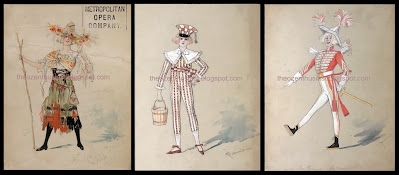
I didn't spot anything in the group from these two prize shows, but my collecting interest was certainly piqued. Then later that day I took a closer look through the listing and was caught by this design. It slowly dawned on me that this costume was created for Cynthia Cynch, the Lady Lunatic in The Wizard of Oz! This is her Act 1 costume, and the drawing shows her during one of her Ophelia-like moments, mourning the disappearance of her lover:

"Yes; mad through with blighted love. Now will I to the vegetable garden where I last saw him.

(Taking objects from basket on arm.)

Here are young spring onions - they're for insomnia; here's celery for remembrance,

- and here are March strawberries - for -- a dollar a box!

"Oh, he never more will come,

And I wonder where he's went.

Hey nonney, hey nonney hey!"

(Exit a la Ophelia, L.I.)

The photo on the left shows Allene Crater wearing the finished costume. It's not surprising that the auction house failed to call out the significance of this piece - how many people have ever heard of Cynthia Cynch? The character doesn't appear in any version of The Wizard of Oz other than the 1903 musical. Of course this fired my determination to acquire the group of drawings, and I was quite happy when I won the lot with minimal competition.

(I should mention the presence of the stamp from the Metropolitan Opera, which simply throws confusion on the piece. Siedle's husband Edward was the highly regarded prop-master and technical director at the Met, and I believe that after her early death (or even before) many of her drawings were archived there. It's not uncommon to see the stamp on her work, even when it was clearly not designed for the opera house.)

After the auction was over I studied the group of images again, because now this one was nagging at the back of my mind. There was a caption at the bottom of the drawing, that I couldn't quite decipher in the auction house photo - until it suddenly clicked and I read "Lady Lunatic Act 2". Here was a second act design for the same character, making it two Oz drawings in the group of 11!

 I had been able to recognize the Act 1 drawing from familiarity with several photos of the character in costume; but the only second act photo I've seen of Cynthia shows a significantly different outfit (worn on the left by Helen Byron). However, the design is clearly labeled and the repeating pattern of hearts together with the green & white color scheme certainly is appropriate for the character in the Emerald City. 

When I eventually received the drawings and could look at the back of each piece, this was clinched even further. The upper left corner of the first act design is labeled "Byron", meaning Helen Byron who originated the role on Broadway. On the back of the second act drawing was printed "Miss Crater"; Allene Crater took over the role of Cynthia in 1903, and played the character for several years, during which time she married Fred Stone, the original Scarecrow. 

She was with the company when it returned to Broadway in 1904 as the "Edition de Luxe" version of the show. This production included a number of new songs, and - some redesigned costumes. I believe this may be one of the new designs. For more info, check out David Maxine's Vintage Broadway blog where he discusses another redesigned costume.

The backs also have handwritten notes concerning fabric choices, and details about the construction of the costumes; always a fascinating insight into the process of putting a show together. The Act 1 costume describes a necklace of red peppers for the character, and floats the idea of using fresh peppers. On the Act 2 design, attention is called to the “gloves to wrist with long turned up tips to fingers”. It’s fun to ponder whether these particular suggestions were carried out!

These are the first drawings I've run across in the wild of a main character from the show. The Shubert Archive in New York City holds the majority of designs that survive from the production, including the third act costume design for Cynthia. So, here's a reunion of the three drawings!


Saturday, September 7, 2024

Denslow's Par-lor Pets


In 1907 and 1908 W. W. Denslow produced a series of comic drawings, illustrating verses written by Dudley A. Bragdon. These are collectively known as the Par-lor Pets series, and the individual panels comment on the various objectionable behaviors of guests. They were published in the Sunday Magazine, a weekly newspaper supplement that was syndicated and issued with a number of papers around the country. Denslow and Bragdon had previously collaborated on the book Billy Bounce, in 1906.

I have found ten examples of the comic on the Library of Congress Chronicling America website. I'm not certain if it is the entire series, but it seems like a good round number that could be a complete set. These ten pieces were published from November 24, 1907 to June 21st, 1908; they were not issued weekly, but vary from month to month. Some months feature one cartoon, others two, and May of 1908 doesn't seem to have any!

(In the comments below, Michael Gessel mentions that Doug Greene catalogued 12 examples from this series - I've since found the examples for July 12 and Sept 6, and included them with the others.)

The series is numbered from I to X, with the subtitle "Extract from Ill Nature Studies", and they were published in numerical order. Click on the images to read the complete text.


November 24, 1907 is The Parlor Thanksgiving Turkey:

Oh, look and see! Whom have we here
With coun-te-nance so smirk-y?
He's saying grace. Of course you've guessed.
'Tis a Thanks-giv-ing Tur-key

December 8, 1907 is The Par-lor Li-on:

Oh! see the gen-tle Par-lor Li-on!
Ob-serve his taw-ny mane!
For our de-light he opes his mouth
And roars and roars a-gain.
Jan 5, 1908 is The Par-lor Kit-ten:

The Par-lor Kit-ten next we see.
Ob-serve her cun-ning pose!
What do I think that she’ll do next?
My dear, no-bod-y knows.

January 19, 1908 is The Par-lor Bore:

Of all the beasts that roam the room
Be-ware the Par-lor Bore;
He stalks the so-cial jun-gle and
He lurks be-hind the door;
 
February 16, 1908 is the Par-lor Owl:
 
What is this bird that looks so wise?
Pray name this won-drous fowl
In yon-der sol-emn bird you see
The fa-mous Par-lor Owl.


March 15, 108 is The Par-lor Clam:
 
Ob-serve the silent Par-lor Clam
In clam-my calm-ness sit-ting.

Al-though 'tis sel-fish to be so
A shell-fish fit is fit-ting. 
March 22, 1908 is The Par-lor Bear:
 
Pray note with care the snarl-ing beast
That sulks in yon-der chair;
That fierce out-rage-ous an-i-mal.
So called The Par-lor Bear.
 
April 12, 1908 is The Par-lor Pig:
 
Oh! see the pant-ing Par-lor Pig!
Ob-serve his tense ex-pres-sion! 
How val-iant-ly he fights to lead
The din-ing room pro-ces-sion!

 
April 26, 1908 is The Par-lor Pup-py:
 
Oh see the Par-lor Pup-py! He
Is mouth-ing some one's glove.
He'll steal it if he gets the chance,–
We call that "Pup-py Love."

 
June 21, 1908 is The Par-lor-Fer-ret:
 
Be-hold the Par-lor Fer-ret! See
His black and bead-y eye!
At dig-ging bur-ied scan-dal up
He-s cun-ning, sharp and sly. 


As far as I know, this was the last of the series; it even features portraits of Denslow and Bragdon as the two gentlemen fleeing the room!

Below are the two missing episodes mentioned in the comment section:

July 12, 1908 is The Par-lor Shark:

Ob-serve the Wall Street Par-lor Shark -
You won-der what he's say-ing?
Don't spec-u-late on what he says
Be-cause I'm sure he's prey-ing.


September 6 is The Par-lor Cat:
 
Ob-serve the Par-lor Cat my child.
And when you chance to meet her
Be care-ful not to cross her path,
Be care-ful how you greet her.


I recently purchased the original drawing for the fifth pet of the series, The Par-lor Owl. It's possible to think of the Owl as another self-portrait of Denslow, with its parted hair and walrus mustache. Perhaps he identified with this particular pet!
 
As with so much antique illustration art, this piece has some condition issues; but it's a fine large example of Denslow's bold style from that period. The panel measures 15" x 15".


Monday, October 9, 2023

Pulpy Neill


Along with his his regular Oz work and other illustrative endeavors, John R. Neill produced a number of drawings for the adventure magazines, or pulps, of the early 20th century. Although he didn’t do the cover art of the magazines, quite a few issues are filled with his interior illustrations. These inexpensive publications were at their peak from the 1920's -1940's, coinciding nicely with Neill's career. Paper shortages during the second World War helped to bring about the decline of the pulps, and by 1957 the genre was fairly defunct.

I have three examples of this style of work, but I hadn't tried tracking down where the drawings may have been originally used. One is clearly labeled, while the other two have some notations but no definite instructions. Thanks to some swift research by Atticus Gannaway, I now know what my mystery drawings were intended to illustrate.

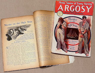
The labeled drawing was published in the December 20th, 1930 edition of Argosy Magazine. Argosy was the original pulp, starting in 1896 and running until 1942. For the cheap paper of the pulps, drawings were best when bold with strong line work - a style well suited to Neill! This particular illustration was used for the fourth and final installment of Murder on the High Seas, written by George F. Worts. It's shown here together with the magazine containing the first installment.

The back of the drawing bears the information of title, date and author, together with the stamp of the Frank A. Munsey Co., the publishers of Argosy.

As it turns out, the other two drawings were not used for publication, making identification a bit trickier - but Atticus did track them down!

The first was intended for a story in Adventure magazine, from February 15th, 1929. This was titled Off Finisterre, and written by Albert Richard Wetjen. A Neill drawing was used for the magazine, but it appears to be a simpler variation of the one in my collection. In both cases a man is seen on the deck of a ship, shooting a flare into the night sky. The published drawing is tall and narrow, rather than the square proportions of the unpublished version, which may explain why a different drawing was needed. The published version is more dramatic, with large areas of shadow and black sky - which may be another reason for the change. A notation reading "Off Finistere" is written on the unpublished piece.

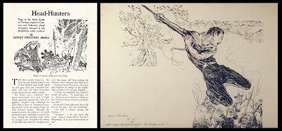
The other drawing has the hand written caption “with every bit of his strength he swung out”, and “Headhunters p. 15” at the lower left. At first it appeared that this may have been drawn for the September 18th, 1919 issue of Adventure magazine; a story titled Head-Hunters and Gold was published, along with a different Neill illustration. But this was not the case, as Atticus soon found another tale. This was simply titled Head-Hunters, by Sidney Herschel Small, and was published in the June 20th, 1931 issue of Argosy. Once again a Neill drawing was used to illustrate the story, but this time I think it lacks the drama of the unpublished piece.
 
Far more dynamic than the sedate image showing natives filing through the jungle, the unused illustration pictures the hero swinging on a vine, about to attack the cannibals. In case of any doubt regarding its intended use, the handwritten caption precisely matches the printed moment in the story.


Sunday, August 13, 2023

My Dear Mr. Neill (Part 3)

Click here for Part 1 of this article 

Click here for Part 2  of this article

Marie Lufkin succeeded in commissioning a large Oz painting from John R. Neill, to hang over the fireplace in her new living room. At the same time, a second smaller commission was placed; Neill was to design a bookplate for the Lufkins.

On the back of one of the sketches for the fireplace painting is a rough pencil drawing for the bookplate design. The figures of the Scarecrow and Tin Man are shown carrying piles of perilously stacked books, which are starting to topple. There are a couple drafts of lettering for the inscription, and of course Marie had input on this design:

   About the book plate. The only thing is that I would like it rectangular and to have the inscription "Marie and Elgood Lufkin - their book". Don't you think that that is sufficient? I don't think it is necessary to have "The Land of Oz" anyplace, do you, as that will be understood by the characters drawn -? However, you decide about that, as you know best, and I know that whatever you do will be perfect.

In a letter from November 4th, 1936, Marie thanked Neill for the finished fireplace painting, and went on to say:

We love everything you have done for us and we appreciate your kindness and friendship more than I can ever tell you. 

I am enclosing one of the finished bookplates. Aren't they keen? - We're crazy about them.  

The image on the finished bookplate is reversed from the sketch, with the characters enclosed in one of Neill’s fanciful and detail-filled borders. The cost of the drawing for this piece was $50.


A couple years later Neill designed a holiday card for the couple, for the year 1939-1940. The artist drew a picture of the Lufkin's living room, complete with Oz painting over the fireplace, and Oz characters dancing before the fire. The fire itself has been colored red, by hand.

The card is large, a full 8.5" x 11", and contains a holiday greeting hand-lettered by Neill. The artist was no stranger to designing holiday cards, as he had drawn his own family cards for a number of years (see post). This card was quite a change from the small Christmas note the Lufkins had sent to Neill the previous year!
The Lufkins obtained a variety of other things from Neill over the years, including a second, smaller, original Oz painting. This was designed by the artist for an antique shop owned by Marie, appropriately called The Land of Oz Antique Shop. 

After Neill's death in 1943, Marie sent a letter of condolence to his widow:

Dear Mrs. Neill:

I just heard of Mr. Neill's death this morning and I wanted to write you immediately to tell you how badly we feel for you and yours and the great loss his death will be to all.

I only met Mr Neill once, as you know, but I really feel that I knew him so well and I was very fond of him.

Elgood and I send you and your family our deepest sympathy and be assured that you will be constantly in our thoughts and prayers. 

Always sincerely

Marie Murray Lufkin

Monday, August 7, 2023

My Dear Mr Neill (Part 2)

 
About a year ago I blogged about the start of the relationship between the Lufkin family and Oz illustrator John R. Neill. Letters from Marie Lufkin to the artist show the progress of the connection, and how the friendship resulted in the building of a unique collection of the artist's work.
 
Marie was persistent in applying to Neill for artwork, particularly for the watercolors used in The Emerald City of Oz. After learning that he didn’t actually own any of those pieces, she commissioned the illustrator to create a large new Oz painting. This was to hang over the fireplace in the living room of the Connecticut farm that the Lufkins were renovating. I particularly like this note from Marie, which was enclosed in a letter dated July 21st, 1936. It details her ideas for the design of the painting:

I think the panel should have a border around. Don’t you?

 As you know my favorite characters are the Scarecrow, Pumpkinhead, the Wizard, Dorothy, Ozma & Glinda, the Tin Woodman, Toto, the Cowardly Lion & the Hungry Tiger, Tick-Tock. (sic)

She was fairly comprehensive in her character list!

The back of the page also has a sketch showing the size for the painting, and indicating how it would be placed above the fireplace. 

The letter that was included with the note brings up the apparently embarrassing question of what the painting would cost:

It's a very ticklish subject Mr Neill, and I hate writing or talking about it, when you were such a wonder to say that you would do it - but I have to - How much money will it cost? Now it's out and I'm relieved - It's been worrying me for weeks how I could ask and I guess the simplest way is the best.

Once that ticklish question had been answered, the work began in earnest. A letter from August 14th reads:

Dear Mr. Neill -

I loved talking to you the other night and was delighted to hear that you are really on your way with "our Oz painting" - It sounds gorgeous & El & I both loved your idea of the Cowardly Lion & the Hungry Tiger leading the procession - DO send me a sketch of it soon - I can hardly wait to see it!

Neill created a number of color sketches for this project, in various sizes and degrees of finish. I have three early rough drafts, trying out layouts, character placement and color schemes. Eventually a more finished piece was sent to the Lufkins for their approval, and finally the actual painting was completed.
 
The finished artwork was shipped on October 10th, 1936. The shipping bill reveals the answer to Marie Lufkin's "ticklish question"; a value of $150 is listed for the final painting. 
 
Marie was thrilled with the piece and in a letter dated November 4th, 1936 she thanks Neill for the painting:

The painting is just too perfect and makes the living room. We are going to put a very light yellow wash on the walls - How do you think that sounds? Also Venetian blinds & I have not decided on the chintz - It sounds finished doesn’t it? Well it is, in my mind, but you should see the room actually! At the present moment there is a buzz saw going at top speed. Shavings all over the floor & carpenters banging away.
 
 She also says:

Of course I wanted you to send me a bill, and I want to thank you for being so generous and thoughtful with your work. As soon as our addition is finished Elgood and I want you and Mrs. Neill to come up for a night. You would wouldn't you? We're not a bit sporty as you know, so you wouldn't have to do anything you didn't want to and we'd love to have you both.

It doesn’t appear that Neill ever did make it up to the farm. I believe Marie only met him in person once.

When the house was sold in later years, the painting was removed by the family and preserved. A page from the prospectus for the house sale shows the living room, with the Oz panel still in its original location (image courtesy of Brady Schwind).

Monday, July 3, 2023

Shirley Temple Land

Here’s a pair of fun items I recently picked up; two costume designs from the Shirley Temple television production of The Land of Oz.

Shirley Temple had a long association with Oz; as a child, she was a fan of the book series. When MGM made the 1939 film version of The Wizard of Oz, it was rumored that Shirley was to be lent to the studio to star as Dorothy. Of course this didn’t happen, but in 1960 the Shirley Temple Show produced a version of The Land of Oz on NBC TV, starring Shirley as Tip/Ozma. 

The show is a loose adaptation of L. Frank Baum’s second Oz book, and one of the few examples of a presentation of a later Oz story. Jonathan Winters played Lord Nikidik, one of the villains of the piece, and these are designs for his two costumes. Fabric samples for each outfit are still attached to the drawings.

The first drawing shows the suit worn by Jonathan Winters as Lord Nikidik at the opening of the story; the drawing bears the notation Radiant Violet - perhaps a name for the outfit? I've attached a couple rather blurry screen captures of the final costume in use. Agnes Moorehead, as the witch Mombi, is also shown. Apparently her performance in this role led to her playing another witch a few years later, Endora on Bewitched.

 The second design is for the uniform worn when Lord Nikidik tries to overthrow the Emerald City; this one is noted Potent Purple. The fabrics for the coat and pants that are attached to the drawing are both white, with a note that they are to be dyed to match a different fabric swatch.

The costumes were designed by Robert (or Bob) Carlton, who did quite a bit of television costume work from the 1950’s into the 1980’s.

Friday, November 4, 2022

Pearls and Pumpkins

 This past weekend Irwin and I visited the Kerlan Collection, at the University of Minnesota, to view the W. W. Denslow materials in their collection. We were accompanied by Brady Schwind, who was doing some research for his Arts of the Imagination Foundation. I’ve been to the Kerlan a number of times over the years, but it’s always fun to revisit and view interesting materials.

Among their Denslow holdings is the publisher’s dummy for The Pearl and the Pumpkin, written by Denslow and Paul West, and published by G. W. Dillingham in 1904. This is a fascinating piece, showing how the layout of the final book was developed. Proofs of illustrations are cut and pasted in place on blank pages, to figure out the spacing and typesetting of the final book. 

In the above image, the dummy title page is shown on the left, and a photo of the final title page is on the right. There's been a change to the credits; rather than "pictures by the Authors", the finished book credits Denslow alone, and stresses his past achievements.

One of the unusual aspects of the dummy is the color scheme used on the illustration proofs. In the final book, the drawings are printed in black and orange. But for this working copy, the illustrations were printed in turquoise and orange. The big difference is that the proof illustrations appear to have three colors, since the areas where the two colors overlap show as a deep olive green. In the published version, the use of black ink instead of turquoise means that the overlapping areas simply look black. It’s a shame the trial colors weren’t used in the final book!

Another interesting point is the endpaper design. In the dummy, Denslow has sketched an illustration of Pearl and Joe, (the pumpkin), surrounded by jack o’lanterns. The published book shows secondary characters with Joe, and Pearl has disappeared! The sketch in the dummy feels considerably livelier to me. The endpapers of the first printing of the book were printed in turquoise, which almost seems to be a holdover from the original turquoise and orange color scheme; but later printings changed to the orange and black inks that are used in the rest of the illustrations.

It was a very appropriate visit for Halloween weekend!