Welcome to my blog, featuring various pieces from my collection of Oz books, artwork and memorabilia!
Showing posts with label Oz book. Show all posts

Monday, August 7, 2023

My Dear Mr Neill (Part 2)

 
About a year ago I blogged about the start of the relationship between the Lufkin family and Oz illustrator John R. Neill. Letters from Marie Lufkin to the artist show the progress of the connection, and how the friendship resulted in the building of a unique collection of the artist's work.
 
Marie was persistent in applying to Neill for artwork, particularly for the watercolors used in The Emerald City of Oz. After learning that he didn’t actually own any of those pieces, she commissioned the illustrator to create a large new Oz painting. This was to hang over the fireplace in the living room of the Connecticut farm that the Lufkins were renovating. I particularly like this note from Marie, which was enclosed in a letter dated July 21st, 1936. It details her ideas for the design of the painting:

I think the panel should have a border around. Don’t you?

 As you know my favorite characters are the Scarecrow, Pumpkinhead, the Wizard, Dorothy, Ozma & Glinda, the Tin Woodman, Toto, the Cowardly Lion & the Hungry Tiger, Tick-Tock. (sic)

She was fairly comprehensive in her character list!

The back of the page also has a sketch showing the size for the painting, and indicating how it would be placed above the fireplace. 

The letter that was included with the note brings up the apparently embarrassing question of what the painting would cost:

It's a very ticklish subject Mr Neill, and I hate writing or talking about it, when you were such a wonder to say that you would do it - but I have to - How much money will it cost? Now it's out and I'm relieved - It's been worrying me for weeks how I could ask and I guess the simplest way is the best.

Once that ticklish question had been answered, the work began in earnest. A letter from August 14th reads:

Dear Mr. Neill -

I loved talking to you the other night and was delighted to hear that you are really on your way with "our Oz painting" - It sounds gorgeous & El & I both loved your idea of the Cowardly Lion & the Hungry Tiger leading the procession - DO send me a sketch of it soon - I can hardly wait to see it!

Neill created a number of color sketches for this project, in various sizes and degrees of finish. I have three early rough drafts, trying out layouts, character placement and color schemes. Eventually a more finished piece was sent to the Lufkins for their approval, and finally the actual painting was completed.
 
The finished artwork was shipped on October 10th, 1936. The shipping bill reveals the answer to Marie Lufkin's "ticklish question"; a value of $150 is listed for the final painting. 
 
Marie was thrilled with the piece and in a letter dated November 4th, 1936 she thanks Neill for the painting:

The painting is just too perfect and makes the living room. We are going to put a very light yellow wash on the walls - How do you think that sounds? Also Venetian blinds & I have not decided on the chintz - It sounds finished doesn’t it? Well it is, in my mind, but you should see the room actually! At the present moment there is a buzz saw going at top speed. Shavings all over the floor & carpenters banging away.
 
 She also says:

Of course I wanted you to send me a bill, and I want to thank you for being so generous and thoughtful with your work. As soon as our addition is finished Elgood and I want you and Mrs. Neill to come up for a night. You would wouldn't you? We're not a bit sporty as you know, so you wouldn't have to do anything you didn't want to and we'd love to have you both.

It doesn’t appear that Neill ever did make it up to the farm. I believe Marie only met him in person once.

When the house was sold in later years, the painting was removed by the family and preserved. A page from the prospectus for the house sale shows the living room, with the Oz panel still in its original location (image courtesy of Brady Schwind).

Monday, July 10, 2023

Italian Oz


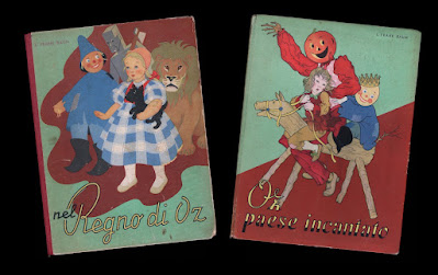
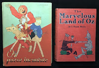
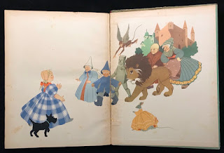
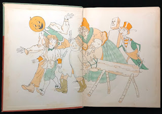
As a collector, I really haven’t branched into the large field of foreign editions of the Oz books. But there are a few examples that I haven’t been able to resist. A couple weeks ago I featured two early British editions; here are two Italian versions of Oz tales, published around the time of the release of the MGM film. These are oversized volumes, larger than the American versions of the stories. They are charming books with lovely line illustrations printed in two colors, as well as full color plates, by Miki Ferro Pelizzari.
 
These examples are the first two titles in the series, The Wizard of Oz and The Land of Oz. This copy of the Wizard is a later printing with a cloth spine. The original printing was issued with a paper spine, like that seen on the copy of Land. I’ve mentioned my dislike of fragile paper spines in the past….
 
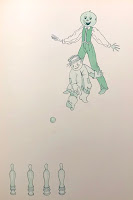
A fun detail in this Italian version of Land of Oz, pointed out to me by Atticus Gannaway, occurs after Jack Pumpkinhead and the Scarecrow meet. Rather than adjourning to the courtyard to play quoits, as in the original book, they play skittles! I knew it was a good game for Oz (see http://theozenthusiast.blogspot.com/2022/11/anyone-for-skittles.html ).
 
Five of the original six titles were published in this series. For some reason, the publishers decided to skip Dorothy and the Wizard in Oz!

Sunday, June 25, 2023

Early British Wizards

The Wonderful Wizard of Oz was first published in 1900 with great success, and around 1906 the first commercial British edition of the book appeared. Although this version was published by Hodder & Stoughton in England, it is essentially the same as the American Bobbs-Merrill edition from the same period, featuring W. W. Denslow’s two-color text illustrations and 16 color plates. 

But the cover colors are different, making a lighter and brighter book, which seems more appealing for a children’s story. Instead of deep olive green cloth stamped in black and orange, the British edition is bound in a lighter green textured cloth, and stamped in peach, black and dark green. The size of the book is also just a touch larger.

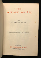
The title page shows both the Bobbs-Merrill imprint, which is part of the hand-lettered artwork, and an additional Hodder & Stoughton identification. Relatively few copies have turned up over the years, making me wonder how much of a success this book was with the Brits!

Around 1926 another edition was published, this time by Hutchinson & Co. As before, the book has the general appearance of the contemporary Bobbs-Merrill version; but it’s a much smaller book.

It’s almost a miniature, being only 5” x 7”, with far fewer of Denslow’s illustrations and no color plates. Perhaps this was done as a tie-in to the Larry Semon film version of the story, which was released in 1925. Semon was quite popular in Europe, particularly in France.

 The rather plain title page is printed in two colors, and lists Hutchinson & Co. as publishers. Hutchinson would go on to print later editions of the book, including the more elaborate version published to tie in with the release of the MGM film in England.

Wednesday, February 22, 2023

The Perils of Paper Spines

As a book collector, I've always found paper spines to be completely impractical; especially on children's books, which were never meant to be handled with care! The fragile paper is easily rubbed and torn, and more often than not large chunks will be missing at the top and bottom of the spine; but it was a less expensive alternative to cloth for binding a book, and presumably helped to lower the cost of children's books while raising the profits.

A number of the books illustrated by W.W. Denslow were published in this fashion. His first big success with L. Frank Baum from 1899, Father Goose His Book, was published by George M. Hill in paper covered boards with a paper spine. In spite of the book's huge success, a more enduring binding was never used on any of the later editions, even when publication was taken over by Bobbs Merrill. The example shown above has its full spine, but it’s not at all unusual to find copies of the book like the photo on the left, with several inches gone from either end of the spine, or even the entire spine missing.

The follow up volume, The Songs of Father Goose, was also published in paper covered boards, but did have a sturdier cloth spine - until a new edition was printed by Bobbs Merrill, with a new cover design and paper spine. The paper spine on the copy shown in the photo below has been replaced.
Denslow's hit book from 1901, Denslow's Mother Goose, is another example of this fragile style of binding. Early copies were bound with paper spines, but the publisher McClure seems to have quickly changed this to a much sturdier cloth spine. I wasn't aware of the paper spine version until I stumbled across one recently - the bottom of the spine is missing 2 inches, which I've adjusted in the photo. The small advertising card shows the original cover design with paper spine, with the title printed in black and Denslow's seahorse logo printed in brown - the cloth spine version is simply printed in black.
In 1902, Denslow's Night Before Christmas was published by G. W Dillingham. Once again, the publisher chose to use a binding of paper boards and paper spine. In this case, Denslow’s design for the cover takes advantage of the format, with a large image of Santa in his sleigh that spreads across the spine and rear board. But copies today are rarely found with the spine intact, destroying the concept. The book quickly switched to a cloth binding with a new cover design for later printings.
The last major children's book illustrated by Denslow was also bound in paper boards, with a paper spine. Consequently The Jeweled Toad, from 1907, is another title that is difficult to find with a spine in nice condition. This was also published by Bobbs Merrill - they do seem to have liked their paper bindings!
Fortunately the most famous Baum/Denslow title, The Wonderful Wizard of Oz, was given the full cloth treatment it deserved in 1900. The same is true of Dot and Tot in Merryland, from 1901. When Dillingham published The Pearl and the Pumpkin in 1904, and Billy Bounce in 1906, they were given full cloth. In 1909, Century published When I Grow Up, bound in cloth. But those early paper spines do add another degree of difficulty to the collecting game!

Sunday, June 26, 2022

Not Just Kid's Stuff!

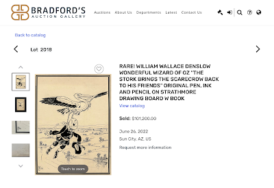
An interesting auction ended today; two original drawings by W. W. Denslow, used as color plates in The Wonderful Wizard of Oz, were sold by Bradford's Auction Gallery, located in Sun City, Arizona.

Artwork from Wonderful Wizard is rarely sold, and the full page drawings used as color plates are more or less unheard of; but in the course of a little over a year, three have now turned up!

One example is in private hands, and was identified on Brady Schwind's Lost Art of Oz blog - https://www.lostartofoz.com/lost-art-of-oz-blog/lost-art-found 

The two that sold today were in the estate of a collector in Arizona; it's fascinating to see where unknown art pops up, and I can't help wondering where the drawings were prior to being in that collection. I'm afraid they didn't come this way - while I did put in a bid, I had no expectations of winning the auction!

A number of drawings from the first Oz book are in the collection of the New York Public Library, but there are still many that are unaccounted for, and could possibly be in unknown locations. But be prepared - if you hope to buy an example of Denslow's work from Wonderful Wizard, you'll need deep pockets; the final bids on todays pieces do not include the 25% buyer's premium that gets added to the total! 


Sunday, March 14, 2021

Land of Oz Story Book

Here's a fun bit of ephemera - the Land of Oz Story Book, published in Great Britain by Hutchinson & Company. This is an abridged version of the second Oz book, 19 pages long, published in a softcover pamphlet form. Hutchinson also published the Land of Oz Paint Book, in a similar format; this had a cover featuring more characters, as well as interior illustrations to color, by the same artist. There’s no date, but I would guess these books are from the same late 1930's/early 1940’s period of the other Oz books the company produced. These were intended to tie in with the British premiere of the MGM film.


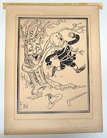
The cover shows Mombi hiding behind a tree, watching Tip and a rather unusual Jack Pumpkinhead pass by. Jack's human face is a bit disconcerting, and reminds me of some of the early 20th century stage productions, like The Wogglebug, The Pearl and the Pumpkin, and The Lady of the Slipper.

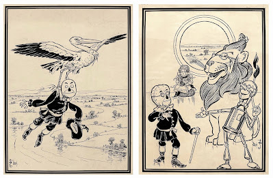
The interior makes use of several of the original John R. Neill drawings, but due to the format of the book, the placement can be rather haphazard. All three scenes shown below happened earlier in the story!


Monday, October 19, 2020

A Golden Road

The original edition of The Road to Oz is one of the handful of Oz books featuring a jacket with a different design than the cover of the book. On the 1909 Reilly & Britton first edition, the book itself has a stamped cover and the jacket is a lovely watercolor of Dorothy and friends, with a metallic gold background. The metallic ink was only used on the earliest copies, and the jacket soon changed to a yellow or blue background, finally settling on yellow after 1920. When Reilly & Britton became Reilly & Lee and dropped the stamped cover, the jacket design was put to use as a paper label. Metallic jackets are few and far between - I don’t own one, the photo shown below on the right is a later version of the jacket with a blue background.

A little while back, I was involved in some discussions concerning the Road to Oz dust jacket, spurred by a fragment of a metallic gold Road jacket. On closer examination, questions arose as to the authenticity of the piece; in the end, it appeared to be a much later jacket that had been altered with gold paint. I thought it would be interesting to see how difficult it might be to do this, and decided to create a copy of the book with a metallic label. I chose to do this to a book rather than a jacket, as it would be a sturdier base to work on, and jackets - even on later printings - are still uncommon enough that I didn’t want to destroy one! The original book was never published this way.

Different shades of yellow were used on the later printings of Road, varying from pale (which is rather attractive) to quite bright. I happened to have a late 1940’s/early 1950’s copy with the bright yellow background that I dislike. I masked the cover using frisket (an adhesive film), and cut out the background areas. With a couple passes of gold spray paint, I had created a non-existent variant of the book! The above photo shows the result. The book on the left is another copy of the standard cover, and on the right is my metallic version. It didn't take long, and the result is actually rather attractive!


Saturday, July 25, 2020

Dust Jackets

Recently, I’ve been scanning a number of dust jackets for Mark Terry at Facsimile Dust Jackets. He offers a large line of dust jacket reproductions for numerous books, including the Oz titles. I was able, along with several other collectors, to help fill the gaps so that an entire run of first state Oz jackets are now available.
Although the metallic inks are missing from Emerald City, Road, and Dorothy and the Wizard, the jackets are beautifully restored and very presentable. There are some very rare jackets represented, which are fun to see, and there are other non-Oz Baum and Thompson titles available - on the left is an example of an original Sky Island together with the reproduction.

While a facsimile jacket doesn't add significant value to a book, the way an original jacket does, it does have decorative value. It's particularly nice in cases where the jacket has imagery seen nowhere else in the book. The jackets are clearly marked as facsimiles on the front flaps, and if you wish, it can be a fun way to spruce up a collection. I used a set of Baum firsts to dress up the set of Bradford Exchange facsimiles that I own.

Sunday, July 19, 2020

Donahue & Company

In 1913 the Bobbs-Merrill Publishing Co. leased the printing plates of their line of L. Frank Baum books to M. A. Donohue & Co., a discount printer. This was quite a prize for Donahue, as it enabled them to print cheap editions of the popular Baum titles, particularly The Wizard of Oz. These editions also undercut the prices of the new Oz books offered by Reilly & Britton during the same time period. This continued until around 1920, when the arrangement ended.

Donahue was established in 1861 as Cox & Donahue Bookbinders. The name changed to Donahue & Henneberry around 1880, and at some point became Donahue Brothers before landing on M. A. Donahue in 1901. As an interesting side note, W. W. Denslow designed a generic book cover for Donahue & Henneberry, (shown on the left), that was in use for a number of years. The company was based in Chicago and continued into the 1960's.

Pictured at the top of the page are two of the Donahue books, a Wizard and a Dot and Tot, both in dust jackets. The quality of the printing in the books declined during this period. At first it was essentially the same as the Bobbs-Merrill editions, but later printings dropped much of the color used in the interior. Still, Donahue was not shy about promoting their books; an original 1913 ad from Publisher's Weekly is shown on the right.

The publishers are quick to call The Wizard the one "pre-eminently great Juvenile Book" written by L. Frank Baum. They go on to claim that their copies are "the regular $1.50 editions in paper, presswork and binding — Sold to the Trade so they can be sold at 60 cents or less and pay you a good profit." Difficult for a retailer to argue with that!

Sunday, June 7, 2020

The Ever-Changing Wizard

 In 1956, the copyright on The Wizard of Oz expired. This gave Reilly & Lee, the publishers of the rest of the Oz series, their first opportunity to publish their own version of the book. But over the next ten years, their book would change repeatedly!

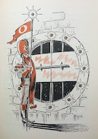
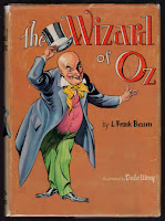
To start, a new edition of the book was set up with new illustrations by Dale Ulrey. This was a more elaborate Oz book than the publishers had produced in a while. Two-color illustrations, in rust and black, were printed throughout, and the front endpapers sported a full color map of Oz. This map had previously been featured in the 1954 Who’s Who in Oz, but in a slightly different form - and not in color! The book also had a dust jacket designed by Ulrey, featuring the Wizard himself. But by 1959, this jacket was replaced with a new design drawn by Roland Roycraft, who designed jackets for a handful of other Oz titles as well.

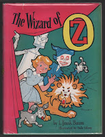
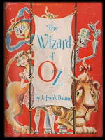
Perhaps the wizard wasn’t grabbing enough attention? The new design was quite bright with a hot pink curtain and cartoon-like images of Dorothy and her three friends. The endpaper map was gone, but the color work was still inside - my copy has the same rust and black color scheme of the earlier version. Then, in 1960 the jacket changed again, this time to a design by Dick Martin.

Martin’s Wizard jacket is a clever concept. Not quite as childlike as the Roycraft jacket, this time we have a wraparound design showing Dorothy and friends on the cover - with the same image, shown from behind, on the rear cover. The interior of the book still features Ulrey’s two-color illustrations, but they have now been given four different secondary colors - blue, green, yellow and red - to tie in with the story (more or less), in the same way that the illustrations did in the original 1900 book.

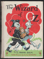
But this cover wasn’t destined to last either - in 1964 the entire book was given another overhaul, and most of the original illustrations by W. W. Denslow (printed in two colors) were restored. Dick Martin was responsible for the redesign, and this time the cover image was printed directly on the cloth of the book, in full color. The design chosen was based on a rare poster by Denslow, advertising the original edition, and a dust jacket was no longer part of the book. (Edit - according to Michael Hearn, the earliest copies of this book were issued with a glassine dust jacket.)

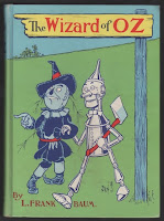
And then a year later the cover changed again! This time it was based on a Denslow drawing of Dorothy being carried from the deadly poppy field, with a white background and spine. The rest of the Baum titles were given new covers as well, creating what’s now known as the “white spine” edition. This final version was the last design used on the book by Reilly & Lee, and remained in use for the next ten years.