Welcome to my blog, featuring various pieces from my collection of Oz books, artwork and memorabilia!
Showing posts with label Reilly Lee. Show all posts

Sunday, August 16, 2020

Marianne and the River Nix

Peter and the Princess was published in 1920 by Reilly and Lee, as an elaborately boxed gift book. The book is a fantasy, by Carl Grabo, telling stories of Peter and the Princess Marianne, who have known each other since before they were born. The stories are charming, along the lines of traditional fairy tales, and the book was clearly an important project for John R. Neill.

This is one of the few books Neill illustrated with a lavish suite of full color illustrations. The other major books with watercolor paintings are Dorothy and the Wizard in Oz and The Emerald City of Oz. Full color paintings were done for the dust jacket of The Road to Oz, as well as the covers of Sea Fairies and Tik-Tok of Oz. A cover and two interior paintings were done for Andersen’s Fairy Tales, and he did do full watercolors for the covers of several other books, as well as duotone illustrations for some titles. But full color paintings are generally unusual in his book work, especially by this time period; by 1920, Neill was not illustrating many books other than the annual Oz title, focusing his attention on producing pieces for periodicals.
 
I've blogged about the book in the past, but today is a little different - this time I'm showing an illustration from the book.  This painting was used as a color plate in Chapter 9, and shows Marianne falling under the enchantment of the River Nix. The Nix has lost his daughter, and when he sees Marianne gazing into the water decides to take her as a replacement, to live with him in the river. She is eventually rescued by Peter, who first has to perform the difficult task of restoring the lost daughter of the Nix.
This is a lovely image, and a great example of the challenges faced by drawings that are now 100 years old. Illustration art can suffer over time - exposure to sun, to damp, rough handling, all can play a part in the survival of original pieces. This painting has had a touch of damp staining, and the board has darkened, possibly through exposure to sunlight or simply from acids in the material. This is why Marianne’s face and other areas seem to have changed their color. If the board were still a light off-white, the image would look rather different. Also, the sky on the left side has been retouched at some point to repair some losses. However, it is still the original art and doesn’t exist in any other form, so it has to be accepted for what it is.

The published version of the painting looks candy colored and bright; this is partly due to printing techniques. The flat, brightly colored inks are not quite the same as the subtler watercolor and gouache used in the original.

The piece seems to have been a family favorite, as it was exhibited along with other examples of Neill's work on several occasions. One example is a 1965 display at the Port Washington Public Library, on Long Island (brochure shown below). Four paintings from Peter and the Princess were included in this exhibition, along with other drawings and sketches by Neill. I would love to know what the condition of this painting was at that time!

Sunday, June 7, 2020

The Ever-Changing Wizard

 In 1956, the copyright on The Wizard of Oz expired. This gave Reilly & Lee, the publishers of the rest of the Oz series, their first opportunity to publish their own version of the book. But over the next ten years, their book would change repeatedly!

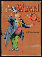
To start, a new edition of the book was set up with new illustrations by Dale Ulrey. This was a more elaborate Oz book than the publishers had produced in a while. Two-color illustrations, in rust and black, were printed throughout, and the front endpapers sported a full color map of Oz. This map had previously been featured in the 1954 Who’s Who in Oz, but in a slightly different form - and not in color! The book also had a dust jacket designed by Ulrey, featuring the Wizard himself. But by 1959, this jacket was replaced with a new design drawn by Roland Roycraft, who designed jackets for a handful of other Oz titles as well.

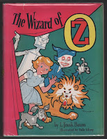
Perhaps the wizard wasn’t grabbing enough attention? The new design was quite bright with a hot pink curtain and cartoon-like images of Dorothy and her three friends. The endpaper map was gone, but the color work was still inside - my copy has the same rust and black color scheme of the earlier version. Then, in 1960 the jacket changed again, this time to a design by Dick Martin.

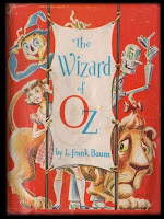
Martin’s Wizard jacket is a clever concept. Not quite as childlike as the Roycraft jacket, this time we have a wraparound design showing Dorothy and friends on the cover - with the same image, shown from behind, on the rear cover. The interior of the book still features Ulrey’s two-color illustrations, but they have now been given four different secondary colors - blue, green, yellow and red - to tie in with the story (more or less), in the same way that the illustrations did in the original 1900 book.

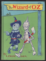
But this cover wasn’t destined to last either - in 1964 the entire book was given another overhaul, and most of the original illustrations by W. W. Denslow (printed in two colors) were restored. Dick Martin was responsible for the redesign, and this time the cover image was printed directly on the cloth of the book, in full color. The design chosen was based on a rare poster by Denslow, advertising the original edition, and a dust jacket was no longer part of the book. (Edit - according to Michael Hearn, the earliest copies of this book were issued with a glassine dust jacket.)

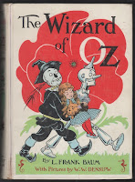
And then a year later the cover changed again! This time it was based on a Denslow drawing of Dorothy being carried from the deadly poppy field, with a white background and spine. The rest of the Baum titles were given new covers as well, creating what’s now known as the “white spine” edition. This final version was the last design used on the book by Reilly & Lee, and remained in use for the next ten years.

Sunday, April 8, 2018

Library Bindings

 Library bindings are a specialty niche in the world of Oz collecting. The books were available from the 1940's to the 1960's in sturdy bindings intended to hold up to heavy use. The covers were usually brightly colored, simplified screenprints of the original cover labels. The spines generally featured the title, without the usual pictorial vignette. As expected, these books often show heavy wear from library use. However, the specialty binding was also available to general customers, so copies occasionally turn up that were never used in a library system.

I haven't expanded into this area, but I did recently pick up an example that came my way. This is a library binding of The Land of Oz, featuring the Roland Roycraft dust jacket design, printed in black and orange on turquoise cloth, from 1959. The Roycraft designs were only issued for a short period of time as dust jackets, not as paper labels mounted to the book covers - so it's fun to have a copy with the design imprinted on the actual book! This particular copy bears no evidence of library use, so it presumably was sold to a home user. It's also interesting to note that the cover has been completely redrawn for this use!

Sunday, May 17, 2015

A Printing Plate

Here's a bit of an Oz novelty. This is an original printing plate, used by the publishers to print a full page illustration by John R. Neill in The Patchwork Girl of Oz. It's a classic image of Scraps, proclaiming "I hate dignity", while catching a stone she's kicked in the air. For a long time, the original printing plates from the Oz books were assumed to have been lost or destroyed, but in 2013 a series of them came to auction. They had been in the collection of rare book collector Richard Manney, and are the only plates known to have survived.

The plate is engraved in zinc, and the stamped number on the upper right refers to its placement in the book - page 131. In the original printing of the book, the illustration was in full color which would have required additional plates, one for each color. This is the black, or key line plate. When the color printing was dropped, in the 1930's, this would have been the only plate used. With the popularity of the Oz books, new printing plates had to be made as old ones wore out, and the publishers kept the original drawings by John R. Neill for this purpose.

Creating the printing plates appears to have involved quite a bit of hand work, in addition to photo-mechanical etching. In this detail, the circular marks of a grinder, used to clean up the background, can be plainly seen.

This has been very nicely presented in a custom box which provides a space for the plate, as well as a new proof pulled from the plate. There is also a pamphlet containing an essay concerning the Oz illustrations, written by Michael Patrick Hearn. It's fascinating as an integral part of the creation of the Oz books!

Sunday, October 5, 2014

Peter and the Princess Revisited


Carl Grabo's Peter and the Princess was published by Reilly and Lee in 1920, and has all the features of an elaborately produced gift book of the time. It was sold in a box, used gold stamping on the cover and spine as well as gilt page edges, and had tissue guards placed over each color plate bearing captions for the images. And the images! Counting the cover, endpapers and title page, along with 8 additional inserts, there are 11 lovely watercolors by John R. Neill - making this one of his most elaborate color plate books since the days of The Emerald City of Oz. Sadly, there are no black and white text illustrations.

This copy is presumably a later variant of the book, as it is not as elaborately produced. The gold stamping and page edges are gone, there are no tissue guards, and most interesting, the cover image has changed. The picture used is the same as the book's frontispiece, and the original cover image is gone from the book. Another example of the variations to be found in books published by Reilly & Britton/Lee!

Friday, August 22, 2014

Oz Anniversary

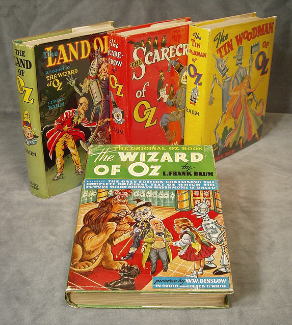
This month marks the 75th anniversary of the classic MGM film The Wizard of Oz. When the movie was originally released in 1939, new editions of the original book were published by both the American publisher Bobbs Merrill, and the English publisher Hutchinson. Reilly and Lee, the publishers of the rest of the Oz series but not the first book, also produced new editions of three older titles - Land of Oz, Scarecrow of Oz and Tin Woodman of Oz - clearly hoping to ride the wave of publicity for the movie.
 
Of all these books, the English edition is the most interesting. The cover and dust jacket have a full color wraparound design featuring a scene from the film, plus there are 8 additional color plates of characters from the movie. These are publicity stills that have been colorized. On the downside, many of the Denslow illustrations have been dropped, and those that remain are printed in black and white.

The American version features a new dust jacket design, with artwork based on Denslow's illustrations. The endpapers are printed in sepia with stills of characters and scenes from the film. The interior is very much the same as the English version, but rather than the color plates of movie characters, there are still 8 two-color plates by Denslow. The English edition does seem to have tried harder!

Reilly and Lee come in a distant third with their efforts - the three titles produced are slightly over-sized with new cover designs by an anonymous artist. While the covers are colorful, I would prefer to have seen what John R. Neill might have come up with for new covers - after all, he had already re-designed several other Oz titles!


Monday, September 2, 2013

Original Prices

Lately I've been looking at the original pricing of the Oz books - it's trivial but interesting!

1900: Wonderful Wizard - $1.50
This was an elaborate children's book, with 24 inserted color plates and color used throughout the book. The price was a little higher than the $1.25 average at the time, but it sounds like a bargain to me!
1904 - 1916: Marvelous Land through Rinkitink - $1.25
The earlier titles had 16 color plates or color throughout the book, while titles after 1913 were standardized with 12 color plates. So, while the price stayed the same, there was a definite cutback in printing costs.

1917:  Lost Princess - $1.35
This was a price increase as America entered World War I. This was also the period when sales of the Oz books began to climb, after a few slack years.
1918 - 1919: Tin Woodman and Magic - $1.50
Another increase along with the end of World War I.
1920 - 1924:  Glinda through Grampa - $2.00
This period was a height of Oz popularity, and the books achieved the highest prices charged prior to 1950. The jump to $2.00 in 1920 was a substantial increase, and this price can be seen on the dustjacket spines of other Oz books published that year. In fact, it's an easy way to date a jacketed book to 1920!
1925 - 1930: Lost King through Yellow Knight - $1.60
A considerable price drop from the previous titles, even before the start of the Great Depression in 1929. I have 2 non-Oz titles by Baum from 1930, both of which are priced at $1.00 - John Dough and Sea Fairies. Clearly the less familiar titles were fading as Oz continued.
1931 - 1932: Pirates and Purple Prince - $1.75
A price raise in the midst of the Great Depression - but not for long!
1933 - 1942: Ojo through Lucky Bucky $1.50
This is the longest period with one price, and the lowest price for the books since 1919!  Color plates were dropped after Wishing Horse in 1935, which would have affected printing costs.
1946: Magical Mimics - $1.75
1949: Shaggy Man - $2.00
1951: Hidden Valley - $2.50
1963: Merry Go Round - $3.95 - all older titles were priced @ $3.50
As the series continued, prices increased regularly. Still, over a 63 year span, prices stayed relatively level!

Tuesday, August 6, 2013

Some Roycraft

Recently I've been adding some later reprints of Oz titles to my collection. These are copies from the 1950s and '60s that were produced by the publishers Reilly & Lee with new cover designs, in hopes of appealing to a new generation of Oz readers.

The three that I'm showing here have covers designed by Roland Roycraft, in a very slapdash cartoon style. They're bright and colorful, and would certainly catch the eye on display in a bookshop. I find them amusing, as the covers have nothing to do with the style of the interior artwork!

Mr Roycraft was an artist with a variety of talents. He spent his later years living in Michigan, teaching watercolor techniques, as well as creating instructional videos and a book. Examples of his work can be seen here on his website. His watercolor work is quite different from this early commercial Oz work!

Thursday, July 4, 2013

A Golden Variant

Dorothy and the Wizard in Oz seems to have gone through more variations in appearance than most of the other Oz books.  I think the most interesting change occurred in the mid 1920's, when some copies of the book were once again bound with a golden label. The copy I'm showing has a Christmas inscription to Winston Powers, reading "Friday, December 25 1925 - from Daddy and Mother". I always enjoy seeing vintage gift inscriptions!

The book was originally published by Reilly & Britton in 1908, with a lavish metallic gold background on the cover label, and a silver vignette of the Tin Woodman on the spine. The silver was the first thing to go, and within a few years, the gold on the label was replaced with a plain yellow background. The stamping of the publisher's name on the spine varies throughout the printing history. Eventually, after the publisher's name changed to Reilly & Lee, the figure of Dorothy was replaced by the words "Popular Edition" which were later dropped from the label leaving the Wizard on his own. Different vignettes are found on the spine, a special slightly smaller format was published for Sears, and finally new cover designs were developed. Below, I show a few of the many variations - there are more!

By the mid 1920's, it wasn't likely that Reilly & Lee would suddenly revive printing the more costly and elaborate label. It seems likely to me that someone simply turned up a supply of the original labels at the bindery and decided to make use of them!

Sunday, February 13, 2011

Dick Martin's Wizard

Previously I showed three of the 1961 Oz adaptations illustrated by Dick Martin. Since then, I've come up with a copy of the first title, The Wizard of Oz. This seems to be the scarcest of the series, and prices can vary wildly. So much of collecting seems to be waiting for the right copy at the right price at the right time!

I've never been a great fan of Martin's work, but he provides colorful and energetic illustrations for the story. It's humorous to note how his Dorothy seems to have fallen asleep in the poppies more elegantly than Denslow's version - but Denslow does conjure up a child who's dropped in her tracks!

I particularly like the rear cover illustration showing the Scarecrow sitting and reading a first edition of the Wonderful Wizard, next to a stack of the new adaptations. The verbiage explains how these adaptations prepare a child for the full length versions of the books - but I think the Scarecrow has the right idea. Skip the adaptations and launch into the real book!

Friday, January 28, 2011

Mermaids!

This year marks the 100th anniversary of The Sea Fairies, L. Frank Baum's attempt to break away from the Land of Oz and start a new series with the characters Trot and Cap'n Bill. The series only lasted through 2 books, with the main characters finally arriving in Oz in Baum's 1915 book, The Scarecrow of Oz.

Mermaids and life under the sea are the main components of this story, giving John R. Neill many opportunities for striking illustrations. He seems to have enjoyed the subject, as he provided another lovely image of a mermaid in his drawing of the whirlpool that captures Trot and Cap'n Bill's boat in The Scarecrow of Oz.

Off-hand, I don't know of any other Baum stories dealing with mermaids, although a mermaid with a parasol makes a brief appearance during an underwater sequence in the 1914 Oz Film Co. production of His Majesty, The Scarecrow of Oz.


This book was not a great success, but it did get reprinted over the years and went through several different cover designs. The original cover, which used a metallic gold background, was dropped quickly and replaced with an adaptation of one of the duotone color plates within the book. When Reilly & Lee reprinted this title in 1920, Neill created a new full color cover, shown on the left.

This was the same time period during which he illustrated Peter and the Princess (1920), and close in time to his illustrating Andersen's Fairy Tales (1923). These three titles seem to be the last book covers Neill produced as full watercolor paintings. He used very similar type styles for the titles of Sea Fairies and Andersen's.

In fact, the cover of Andersen's doesn't really seem to particularly apply to any of the stories within that book, but it does bear a striking resemblance to the final illustration from The Sea Fairies!

Friday, January 21, 2011

John Dough

Here's a copy of John Dough and the Cherub from 1930 or so - the rear dust jacket flap lists Oz titles to Yellow Knight, the Oz book published that year. This must have been one of the final printings of this title by the Reilly & Lee company.

When Reilly & Britton changed to Reilly & Lee in 1919, several of the L. Frank Baum books underwent changes in appearance. In particular, early titles that originally had stamped covers were changed to paper labels. The Patchwork Girl was one exception - although it too was changed in the 1930's. In some cases, this required a bit of re-thinking on the publisher's part.

For John Dough, the original cover design (shown above right) was used, but it was changed to a full color paper label pasted to the front of the book, instead of a 3 color stamping. The design from the spine of the book was used on the spine of the jacket but only printed in black; this raises the problem of John's disappearing bow tie! I would have thought, considering that the cover was now full color, the spine could have been colored as well!


This past Christmas I did get around to making some John Dough gingerbread cookies. Unfortunately, I couldn't lay my hands on any Elixir of Life, the special ingredient...