Welcome to my blog, featuring various pieces from my collection of Oz books, artwork and memorabilia!

Thursday, November 10, 2022

Anyone for Skittles?

Some years ago Irwin and I visited with Kendra Daniels, a collector and dealer in children's illustration art, at her home. We viewed the amazing collections she and her husband Allan had assembled; and among the collections, I saw my first figurative skittle set. 

Skittles is a form of ninepin bowling, for table top or floor. The sets Kendra collected were made in Europe in the 19th century, and consisted of whimsical collections of paper mache figures in wheeled wagons that relate to the characters. An antique example is shown on the right - in this case, a dog with puppies - from the LiveAuctioneers website.

As the summer drew to a close, I began to look about for a new Oz project and decided to give skittles a try. Most of my projects develop from ideas I've had for a very long time!

I decided that Quox, the dragon from Tik-Tok of Oz, would be a natural as a wagon, since he had seating for passengers attached to his back. For the skittles, I chose the Nome King together with an additional troupe of Nomes. The set needed a kingpin, and Ruggedo seemed like a natural choice! 

Quox wears his pearl necklace and gold locket and, as in the book, there are eggs inside the locket to be used for knocking down the Nomes. Wheels are concealed under the dragon's legs, for rolling across the table or floor, and with the use of mini LEDs his tail lights up and his eyes flash.

On the left, Quox can be seen at the start of his paint job. The Nomes are lined up and finished. All the pieces are molded from paper mache like the antique versions. Below, a video shows the set in action!


Friday, November 4, 2022

Pearls and Pumpkins

 This past weekend Irwin and I visited the Kerlan Collection, at the University of Minnesota, to view the W. W. Denslow materials in their collection. We were accompanied by Brady Schwind, who was doing some research for his Arts of the Imagination Foundation. I’ve been to the Kerlan a number of times over the years, but it’s always fun to revisit and view interesting materials.

Among their Denslow holdings is the publisher’s dummy for The Pearl and the Pumpkin, written by Denslow and Paul West, and published by G. W. Dillingham in 1904. This is a fascinating piece, showing how the layout of the final book was developed. Proofs of illustrations are cut and pasted in place on blank pages, to figure out the spacing and typesetting of the final book. 

In the above image, the dummy title page is shown on the left, and a photo of the final title page is on the right. There's been a change to the credits; rather than "pictures by the Authors", the finished book credits Denslow alone, and stresses his past achievements.

One of the unusual aspects of the dummy is the color scheme used on the illustration proofs. In the final book, the drawings are printed in black and orange. But for this working copy, the illustrations were printed in turquoise and orange. The big difference is that the proof illustrations appear to have three colors, since the areas where the two colors overlap show as a deep olive green. In the published version, the use of black ink instead of turquoise means that the overlapping areas simply look black. It’s a shame the trial colors weren’t used in the final book!

Another interesting point is the endpaper design. In the dummy, Denslow has sketched an illustration of Pearl and Joe, (the pumpkin), surrounded by jack o’lanterns. The published book shows secondary characters with Joe, and Pearl has disappeared! The sketch in the dummy feels considerably livelier to me. The endpapers of the first printing of the book were printed in turquoise, which almost seems to be a holdover from the original turquoise and orange color scheme; but later printings changed to the orange and black inks that are used in the rest of the illustrations.

It was a very appropriate visit for Halloween weekend!

Sunday, August 7, 2022

My Dear Mr. Neill (Part 1)

In August of 1935, John R. Neill received a letter that had been forwarded from the publishers Reilly & Lee. Looking at the envelope, it's clear that the letter did a bit of roundabout traveling! It was from Mrs. Elgood Lufkin of Rye, New York, and read as follows:
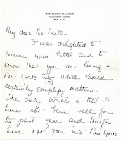
   My dear Mr. Neill -

    Mr Lufkin and I ever since we were very small have loved the Oz stories and their illustrations. So much so that now that we are older we have read them all to our children who love them and are as intrigued by them as we were and are.

    In fact we have called our place which we got last year “The Land of Oz”.

    However this is all aside from the point. We were very fortunate in obtaining two of your original water colors - the “Interior of the Scarecrow’s House” and the Scarecrow’s House with Dorothy the Wizard and Uncle Henry coming to pay the Scarecrow a visit. We are terribly anxious to get any others that we could and I wondered if by writing you and explaining a bit how we feel whether you would be willing to sell any to us.

    It would mean a great deal to the children and to us to have some more of your illustrations and I want you to know that they will be highly prized by us.

    Will you drop me a line and let me know whether you will do this for us. Please?

    Always Sincerely,

    Marie Murray Lufkin
    Aug. 8 1935
 
Once the letter eventually made its way to him, Neill must have replied promptly as another note from Marie, dated September 1st, followed. In this, she offers to send her car and chauffeur to bring Neill to have tea and visit. Or, if that didn’t work -

 …If you do not feel like coming out, if I sent the car would you let the chauffeur bring some out here to me? I couldn’t make out from your letter whether you had any or whether you would be willing to do some illustrations...

The offer of a car and chauffeur indicates that the Lufkins were people of some means; after all, 1935 was not far past the height of the Great Depression. In fact, Elgood Lufkin was the vice president of the Bank of New York. The couple had purchased a farm in Connecticut the previous year, and were hard at work renovating and decorating the house. As it happens, Neill bought a farm in Flanders, New Jersey the following year; most likely, the work of restoring the properties was a common point of interest between them. I particularly like the offer of sending the chauffeur to pick up a selection of artwork to view!

Apparently, there was no response to this letter and the correspondence died. But Marie wasn't ready to give up, and in June of 1936 another letter was forwarded to Neill from Reilly & Lee. She reintroduces herself, and again declares her interest in buying some Oz artwork.

…As I received no reply I took it that you were not interested but even so I am writing again to ask if you have any of the original illustrations for the “Emerald City" besides the exterior & interior of the Scarecrows house as we have those already.

    Please reply one way or the other as I am so anxious to know if we can ever find any for ourselves...

An intriguing side note to the correspondence is the fact that the Lufkins already owned two watercolors from The Emerald City of Oz! How they managed to acquire these drawings is not known, but it does seem to indicate that Oz art could be found in the wild. This time, she did receive a quick reply from Neill and hurried to respond:

  
 …What a relief receiving your letter! You have no idea how we loved it. From now until you have time to do something for us, I am going to pester you with letters so that you won’t get a chance to lose our address again.

    Your farm at Flanders sounds really magical. Just the way we feel ours is - and you must be the perfect wizard because although you say you are “expected to be a sort of Wizard of Oz without the qualifications,” to us you will always be the real Wizard of Oz, as you have made the stories live for us and our children…

Clearly, having finally won Neill’s attention, Marie wasn’t about to let go! This was to be the start of a relationship that continued until Neill’s death in 1943. The family were fans of Neill, and of the Oz books, and they assembled a unique collection as they befriended the artist. The first Oz book Neill wrote, 1940’s Wonder City of Oz, is even dedicated to the Lufkins.

 Click here for Part 2 of this article.

Monday, August 1, 2022

Oz on Ice?

 Here's a costume design by Anthony Holland (1912 - 2001) for The Wizard of Oz, presumably for the Wizard himself!

Holland was a well known British costume designer, creating his first show in 1933. He also designed sets, and worked with theatres throughout Britain. After the second world war, he worked in London's West End and also became known as a designer for a number of pantomimes and ice shows - popular English entertainment at that time. He retired from designing in 1981.

This is a very traditional looking Wizard with a long white beard and pointed hat, not quite the American huckster of L. Frank Baum's story. It's an attractive design, featuring all twelve zodiac symbols embroidered in green sequins, as well as the sun and moon.

There's no specific notification, but I think this may have been designed for the Tom Arnold adaptation of The Wizard of Oz, an ice show that toured England in the 1960s. As can be seen in the center spread of the program, the costumes were designed by Anthony Holland. Unfortunately, I haven't found any photos of the production itself to see if this costume was actually used. There are several names written on the design, possibly of various performers over the years?

The artist donated a large number of his designs to The Victoria and Albert Museum in 1996.

Monday, July 18, 2022

Denslow's Red Riding Hood

In December 1902, the comic section of The New York Herald published four adaptations of classic stories, rewritten and illustrated by W. W Denslow. These would be the genesis for the series of Denslow's Picture Books for Children, which were published by Charles Dillingham in 1903 and 1904.

Among these first stories was Little Red Riding Hood, adapted in poetic form and revised to eliminate horrors - in this case, Grandma subdues the wolf and he becomes as tame as a pet dog. This idea of eliminating nightmares from stories for children was common to both Denslow and L. Frank Baum; Baum writes of this concept in the introduction to his modern fairy tale, The Wonderful Wizard of Oz. As to how successful they were at achieving their goal is another question! 

At any rate, here is an original piece of the artwork from this story. Red Riding Hood is seated in a high chair as the newly domesticated Wolf begs for a treat. Various traces of preliminary pencil work can be seen, which is always an interesting part of viewing original artwork!

The drawing is cut from a larger sheet, and mounted on a backing piece. I seem to remember hearing that some of Denslow’s newspaper comic drawings suffered water damage many years ago, while in the possession of a book dealer. Consequently, what could be salvaged was cut from the various pages for later sale. At least the artwork was not entirely scrapped!


Sunday, July 10, 2022

Publicity, Publicity!


The 1903 production of The Wizard of Oz made stars of Fred Stone and David Montgomery, and their performances certainly deserve credit for a great deal of the success of the show. But there were also performers behind the scenes, working tirelessly to promote the Broadway smash, and keep it steadily in the public eye.

Townsend Walsh (1872 - 1935) was the business manager of the show, and the man responsible for promotion and publicity. He worked closely with Fred Hamlin, the producer, and John Flaherty, manager of the Majestic Theatre. The image above shows Walsh shaking hands with Fred Stone as the Scarecrow; this was used in a souvenir album of the show, indicating the importance of Walsh's work.

Here are two examples of letters sent to help in promoting the show, already a striking success. The first is dated April 8, 1903 and written by Walsh, to the dramatic editor of an unnamed paper. In a very straightforward way, he offers free tickets in exchange for printing a notice concerning The Wizard of Oz. The editor is offered free tickets for the rest of the season, which seems a rather generous offer.

The second is a little later, July 17th 1903, and written by Flaherty. Once again, a free viewing of the show is offered in exchange for printing an article about the production. However, the terms aren't quite so generous - rather than being offered free tickets for the rest of the season, a single performance is offered, with the exclusion of Saturday nights and Souvenir performances.
Clearly the show was doing good business, so seats might as well be saved for ticket buyers!

This second letter is addressed to the editor of the Times in Haverstraw, NY. I think this may be the Rockland County Times, which did publish a blurb on the show two weeks later, on August 1st. Whether this is the article mentioned in the letter, I do not know - but it's a possibility!

The New York Public Library holds an archive of material that belonged to Walsh, including the lovely little Denslow drawing of the Scarecrow shown below. I haven't viewed the archive, but it might be an interesting future project!

Sunday, July 3, 2022

Christmas in July

Reilly & Britton published The Christmas Stocking Series in 1905, and it proved to be a popular item. The series of six small books continued in print into the 1920s, utilizing several different packaging formats. I recently picked up one of the early variations.

This particular version  pairs two of the books together in a titled box. The books were published with red, burgundy, green, or blue cloth spines and back covers - these copies have the blue cloth. 

The series is of interest to Oz fans because of the introduction, written by L. Frank Baum and used in each small book. This short essay tells the origin of the Christmas stocking, and was written specifically for this series. It was well promoted in publicity for the books, and provided a good selling point.

Another later variation, ca. 1913, was the steamer trunk box; I've shown this before but here it is again for comparison. All six titles were housed in a fanciful cardboard trunk, covered in whimsical travel labels. The bindings of the books had changed by this time, to red boards with a green holly design. This packaging remained in use into the 1920s.


Sunday, June 26, 2022

Not Just Kid's Stuff!

An interesting auction ended today; two original drawings by W. W. Denslow, used as color plates in The Wonderful Wizard of Oz, were sold by Bradford's Auction Gallery, located in Sun City, Arizona.

Artwork from Wonderful Wizard is rarely sold, and the full page drawings used as color plates are more or less unheard of; but in the course of a little over a year, three have now turned up!

One example is in private hands, and was identified on Brady Schwind's Lost Art of Oz blog - https://www.lostartofoz.com/lost-art-of-oz-blog/lost-art-found 

The two that sold today were in the estate of a collector in Arizona; it's fascinating to see where unknown art pops up, and I can't help wondering where the drawings were prior to being in that collection. I'm afraid they didn't come this way - while I did put in a bid, I had no expectations of winning the auction!

A number of drawings from the first Oz book are in the collection of the New York Public Library, but there are still many that are unaccounted for, and could possibly be in unknown locations. But be prepared - if you hope to buy an example of Denslow's work from Wonderful Wizard, you'll need deep pockets; the final bids on todays pieces do not include the 25% buyer's premium that gets added to the total! 


Saturday, June 25, 2022

3 by Denslow

It’s been quite a while since I’ve shown a Rand McNally title with cover art by W. W. Denslow, and here I have three! 
 
The first is Hernani the Jew, written by A. N. Homer and published in 1897. This is a classic example of Denslow’s “shield” style of cover design, using some basic elements found in a number of his other covers.
The story concerns the marital misunderstandings of Hernani, a wealthy banker, and his wife. The setting is Poland, with the backdrop of the unsuccessful January Uprising of 1863. The red and white eagle, emblem of Poland, is the main feature of the cover, together with a pair of torches and a sword and crown on the spine. On the rear cover, we see a profile of Sara, the wife of Hernani. The story is one of loss, both of country and wealth, while Poland was under the control of Russia. It ends on a happier note, but is rather depressing overall.

The next is My Invisible Partner, by Thomas S. Denison and published in 1898. This is a sparser style of design, with elements scattered across the front and rear covers, and featuring some very Ozzy looking poppies!

This is billed as a story of the supernatural, and primarily takes place in New Mexico, with detours to Michigan. It’s a tale of mining life, romance and murder, with a main character who is subjected to several out-of-body experiences, and a mystery solved by the discovery of an unknown twin. 

Finally we have A Daughter of Cuba, by Helen M. Bowen, published in 1898. This title combines a shield design with a landscape, including a poison ring on the rear cover.

Events take place during the Cuban revolution of 1897, leading up to the entrance of America into the Spanish American war. The daughter of a wealthy planter is committed to the Cuban cause, and inspires others to join her campaign. Bandits, a lost heir, an American journalist and of course that poison ring all play parts in the story.

Monday, June 13, 2022

Macaronis


 Life Among the Macaronis was a series of comical drawings created by John R. Neill, and published in The Sunday Magazine, a syndicated Sunday newspaper supplement used by a variety of papers around the country. The magazine was in circulation from 1904 through 1916, using a small title change depending on what city and paper it supplemented. Neill seems to have contributed around the period of 1904 - 1906.

This example was the rear cover of the May 15th, 1904 issue, not long before the publication of Neill's first Oz work in The Marvelous Land of Oz. The series of limericks were written by Neill, to accompany his humorous drawings. Postcards of the characters were also produced; here are three examples, distributed by the Boston Sunday Post, showing cropped versions of the characters seen above:

The individual cards have been titled “Off for the links”, “A terrific drive”, and “A disaster on the links”. The extra space at the right of each card was for jotting a short message - the back of early postcards was reserved for an address, no additional writing.

Neill seems to have been fond of his Macaronis; he used the same elongated figures over a number of years, as seen in a 1901 single panel Christmas cartoon.

 
They also bear a strong resemblance to the Soldier with the Green Whiskers in 1904's The Marvelous Land of Oz, and the Hilanders in John Dough and the Cherub, from 1906 -
 Here's an undated original drawing by Neill, of a musical Macaroni puffing on a horn and surrounded by other whimsical wind instruments. This piece is inscribed "To my old friend M. L. Stein", over the artist's signature.

A Macaroni was a late 18th century fop or dandy, an overly elegant figure extravagant in clothing and manner. This helps explain the traditional lyric from Yankee Doodle Dandy - "Stuck a feather in his cap and called it macaroni"!


Monday, April 25, 2022

The Girl from Up There

 
In 1903 the vaudeville team of Montgomery & Stone achieved Broadway stardom in The Wizard of Oz. But it wasn’t their first time on Broadway; in 1901, they were featured in The Girl from Up There, starring Edna May, book and lyrics by Hugh Morton and music by Gustave Kerker; one of the many musical comedies to grace Broadway during that time. 
 

The story begins in Polaria, near the North Pole, where a young lady has been frozen in ice for 500 years. She is freed by an explorer with an "electric knife", but in order to stay alive she must drink from the golden cup of Odin within 90 days. The cup was last known to be in the possession of pirates. David Montgomery & Fred Stone made a hit as the pirates (Solomon Scarlet and Christopher Grunt) who befriend the heroine.


Prior to that time, the pair had built a solid reputation as blackface comedians in vaudeville. When Charles Frohman hired them for the new show, he insisted they should put blackface behind them, and perform in “straight makeup”. This proved to be a success, and after the run of The Girl From Up There, the duo switched to their new routine. They took the successful new act to London, prior to returning to the USA and stardom in The Wizard of Oz.

Edna May gained recognition in The Belle of New York, which ran moderately on Broadway before having a surprisingly successful run in London. While American critics were very much split concerning the talents of Miss May, she conquered London and was declared a star. She was then presented by Charles Frohman as star of his new show, originally announced as The Golden Cup. Perhaps he had some misgivings about her abilities, as he collected a very strong supporting cast to back up his new diva. As star, she collected the princely sum of $500 a week, a far cry from her $15 chorus days. In spite of this, the American critics weren't convinced by Edna in her new role, and a transfer of the show to London was not particularly successful; much was made of Edna appearing on stage in boys clothing for the first time, but even that novelty failed to save the show. However, Edna continued as a favorite of the British stage - as well as a popular subject for postcards! She married a millionaire in 1907 and retired from the theater. When her husband died in 1917, she inherited five million dollars.
There are a number of minor L. Frank Baum/Oz connections with this show, aside from the presence of Montgomery & Stone. The drawings in this post are taken from the souvenir album of the production, which was published by R. H. Russell - publishers of Baum’s A New Wonderland. The drawings are by Archie Gunn, who would go on to design costumes for Baum’s show The Wogglebug. Julian Mitchell directed the piece, and the costumes of the show were designed by Caroline Siedle, both of whom performed the same jobs for The Wizard of Oz

See the comments for a closer connection between Edna May and L. Frank Baum!