Welcome to my blog, featuring various pieces from my collection of Oz books, artwork and memorabilia!

Sunday, June 28, 2020

1907 Mardi Gras Oz

The tradition of formal Mardi Gras parades in New Orleans began in 1856, when a group of businessmen formed the first krewe, or secret society, The Mystick Crewe of Comus. Others followed, and in 1872, Rex was formed, another crewe with its own parades and floats. The Rex parade became a highlight of the Carnival season, due to the beauty of the floats created. 
The theme of the 1907 Rex parade was Classics of Childhood. 20 floats were created, 18 pertaining to this theme as well as a title car and the Rex, King of the Carnival float. Souvenir postcards were made of the individual floats, as well as this folder showing the entire parade. I’ve been unable to find any identifiable photos of these floats, but I keep looking! 

The 20 floats are pictured below, clicking on the image will enlarge it for easier viewing.
While a number of true classics were represented, some of the choices were decidedly more contemporary than others. Among the stories shown was The Wizard of Oz.
The float is firmly based on the original book and W. W. Denslow's illustrations, rather than the popular Broadway show of the period. Featured prominently in front are a pair of Kalidahs, the ferocious creatures with the heads of tigers on the bodies of bears. Behind them are Glinda and The Wicked Witch of the West, with a peek of the back of the Good Witch of the North between them. Next we have one of Glinda's soldiers, and then the Soldier with the Green Whiskers. Above these we see the Scarecrow, Tin Man and Lion. Dorothy seems to be missing, although she could be on the other side of the float! The float is decorated with large emeralds and the towers of the Emerald City, along with poppies from the Deadly Poppy Field.
Another story with an L. Frank Baum connection was also shown. Prince Silverwings, written by Edith Ogden Harrison, was published in 1902 and the author worked with Baum on a scenario for a stage production of the story. Nothing came of that, but several of the characters and themes in later Baum books may well have been inspired by this story. The image of this float has some slight damage and creasing due to the original construction of the inexpensive album.

Sunday, June 21, 2020

Kittens


In 1903 and 1904, W. W. Denslow designed a series of 18 picture books, published by the G.W. Dillingham company. Denslow’s Three Little Kittens is one of the 1904 titles.

Denslow’s take on the traditional nursery rhyme is similar to the style of stories written by L. Frank Baum in Mother Goose in Prose. Denslow was determined to remove any horrors from the tales, and made changes accordingly. In this case there really wasn’t any need of changes, but he did extend the story to include the kittens befriending a rat that they chase into the Glad Lands, where all animals live in peace.

The Glad Lands were previously mentioned in a Christmas cartoon Denslow drew in 1903, which was syndicated in several newspapers. You can click here to read a short blog post I wrote about it several years ago.
Here we have a drawing from this book, used as the interior rear cover, the final image in the book. It’s always interesting to see the difference between the original black & white drawing and the printed color version. The black & white piece is bolder and crisper than the turquoise & orange version seen in the book. But Denslow’s use of color in these books was in itself bold and new, with striking color choices and interesting composition. The block of orange ink in the background of the printed image is simply indicated as a rectangle in the drawing, focusing your eye more firmly on the two characters. In the book, the solid orange rectangle becomes the focus and the characters are secondary.

Sunday, June 14, 2020

Pirates on the Aegean

Here’s another example of a W. W. Denslow cover for a Rand McNally novel - in fact, it’s two examples! Written by Richard Henry Savage and published in 1897, A Modern Corsair is a fairly typical adventure novel of the period.

The story centers on fraud in the insurance business; more specifically, in the shipping trade, where shipwrecked freighters could collect large payouts for lost goods. Much of the action takes place in and around Smyrna, and the story is filled with stereotypical Turks, Greeks, and other ethnic types, who are thwarted by our hero, a young American journalist posing as a British lord.

This is a case of Denslow designing two covers - one for the paperback and one for the hardcover. I came across the paperback version and blogged about it several years ago, but only recently found the hardcover. The paperback design focuses on Agathe the Serpent, a woman whose intentions are mysterious and possibly deadly. The hardcover is more sedate, focusing on a wrecked freighter in the foreground. In both cases, one of Denslow’s more elaborate seahorse signatures is featured.

Sunday, June 7, 2020

The Ever-Changing Wizard

 In 1956, the copyright on The Wizard of Oz expired. This gave Reilly & Lee, the publishers of the rest of the Oz series, their first opportunity to publish their own version of the book. But over the next ten years, their book would change repeatedly!

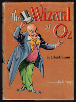
To start, a new edition of the book was set up with new illustrations by Dale Ulrey. This was a more elaborate Oz book than the publishers had produced in a while. Two-color illustrations, in rust and black, were printed throughout, and the front endpapers sported a full color map of Oz. This map had previously been featured in the 1954 Who’s Who in Oz, but in a slightly different form - and not in color! The book also had a dust jacket designed by Ulrey, featuring the Wizard himself. But by 1959, this jacket was replaced with a new design drawn by Roland Roycraft, who designed jackets for a handful of other Oz titles as well.

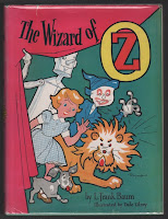
Perhaps the wizard wasn’t grabbing enough attention? The new design was quite bright with a hot pink curtain and cartoon-like images of Dorothy and her three friends. The endpaper map was gone, but the color work was still inside - my copy has the same rust and black color scheme of the earlier version. Then, in 1960 the jacket changed again, this time to a design by Dick Martin.

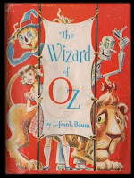
Martin’s Wizard jacket is a clever concept. Not quite as childlike as the Roycraft jacket, this time we have a wraparound design showing Dorothy and friends on the cover - with the same image, shown from behind, on the rear cover. The interior of the book still features Ulrey’s two-color illustrations, but they have now been given four different secondary colors - blue, green, yellow and red - to tie in with the story (more or less), in the same way that the illustrations did in the original 1900 book.

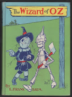
But this cover wasn’t destined to last either - in 1964 the entire book was given another overhaul, and most of the original illustrations by W. W. Denslow (printed in two colors) were restored. Dick Martin was responsible for the redesign, and this time the cover image was printed directly on the cloth of the book, in full color. The design chosen was based on a rare poster by Denslow, advertising the original edition, and a dust jacket was no longer part of the book. (Edit - according to Michael Hearn, the earliest copies of this book were issued with a glassine dust jacket.)

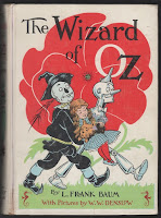
And then a year later the cover changed again! This time it was based on a Denslow drawing of Dorothy being carried from the deadly poppy field, with a white background and spine. The rest of the Baum titles were given new covers as well, creating what’s now known as the “white spine” edition. This final version was the last design used on the book by Reilly & Lee, and remained in use for the next ten years.

Monday, June 1, 2020

A Marvelous Land

When I was in 3rd grade, I purchased this version of The Marvelous Land of Oz, published by Scholastic Book Services. This was my first introduction to the Oz series beyond The Wizard of Oz, and I was happy to find that there was a sequel to the first story.  I grew very fond of this book, which helps account for it's ratty condition today - oddly enough, it was another several years before I expanded into the rest of the series, as I felt content with just the first two books!
While the covers and frontispiece of this version were drawn by Dom Lupo, the interior contained a handful of John R. Neill's original illustrations. This was my first introduction to Neill’s work, and I was hooked by his imagery of the land and characters. But I was unaware that there was an interesting omission - several of the drawings had originally included the character of Tip, but for this edition they were cropped and edited to remove the boy. Presumably this was because he didn't match the three new illustrations, which showed a more contemporary version of the character.
At some point my copy of this book went missing, and I could not find it anywhere. When I was in 4th grade, I discovered a vintage hardback of the book on the classroom bookshelf. This was the personal property of my teacher, Mrs. Smith, who allowed me to look at and read the book during school hours. I was amazed to discover that there was an entire world of illustrations in the book that I had never seen, along with what struck me then as an unusual version of Tip!
Eventually I found my original copy, in the piles of debris on my closet floor, but knew I needed to find the book with all those other illustrations. This was during the time when white cover Reilly & Lee books were available, as well as the more affordable Rand McNally paperbacks. I happily purchased the paperback - it would be a few more years before I learned the the original book had color plates as well!