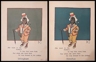
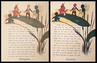
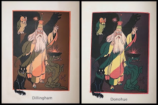
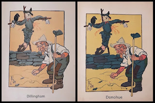
The Dillingham versions present the stories in a sophisticated color range. Denslow's carefully considered palette of soft tones of orange, turquoise and olive green has been replaced in the Donohue editions with a more standard red/yellow/blue selection. This, combined with a pulpier paper of lower quality,
creates murkier images and removes the cosiness of the muted color tones in the original
printings. Presumably the brighter inks were thought to have greater appeal for the child readers. I prefer the original colors, which reflect Denslow's original choices.
In this example from Old Mother Hubbard, the new color scheme upsets the balance of the drawing. The blue background may be more colorful, but it overpowers the rest of the image, making the dog more difficult to see.
This page from Tom Thumb shows the poor effect of the new coloration. The colors are dark and unfriendly, calling too much attention to the drawing compared to the text.And this wizard from Tom Thumb turns a bit garish in his diagonal stripes; the harmony of color seen in the original version is lacking, particularly against the newly dark background.Finally, even our old friend the Scarecrow suffers in this drawing from The House That Jack Built. As with the other examples shown, the darker colors make Denslow's masterly line work difficult to see, and the entire image suffers in consequence.


No comments:
Post a Comment